© 2014-2023 Aliaksandr Drozd
TM Smile Expert includes a full range of oral care products such as toothpastes (for adults and children), toothbrushes, rinses, fresheners, toothpicks, dental floss.
TM was created in 2011, it underwent its first transformations in 2016-2017. The little man was removed from the logo without changing the style. The design became lighter in accordance with the trends of those years. The graphic element on the packaging was designed in the style of SPLAT toothpastes, with thin lines that vaguely resemble a pencil drawing.
Nowadays, the appearance of the packaging of the brand is outdated, sales for 10 months in 2020 compared to 10 months in 2019 fell by 17%.
Products on the shelf do not look attractive. They are boring, faded, and do not arouse consumers’ interest and trust. There is no reflection of the pharmaceutical expertise in it.
The corporate identity of the brand is not well-thought-out. There is no common concept, style, categorization, color differentiation, uniform graphic elements. Now the corporate identity does not provide an opportunity to develop the product lines and does not correspond to the brand's objectives.
Right now, the 2016 redesign style is seen only in adult toothpastes, rinses, and fresheners. Children's toothpastes, toothbrushes and toothpicks are made in a completely different style and with different graphic elements.
GOAL
Increase sales under the network's own brand in the "oral care" category, make the choice of the buyer simple, intuitive and clear. Make a bright appearance of an important brand in this category, attract attention.
Increase sales under the network's own brand in the "oral care" category, make the choice of the buyer simple, intuitive and clear. Make a bright appearance of an important brand in this category, attract attention.
TASKS
1. Restyle the Smile Expert brand logo in accordance with modern trends
2. Create a new, modern corporate identity for the Smile Expert brand.
3. Make up Key Visual + slogan for brand communications.
4. Create print-ready layouts for each line using several SKUs as an example, make recommendations for production, material selection and special postproduction.
tone of voice
Modern, friendly, expert, minimalistic, family-friendly, eco-friendly, caring, trendy, daring, effective, fresh, clear, recognizable, empathic, affinity-inspiring, vital, natural, harmonious


2016
2021

The logo turned out to be modern, concise, trendy. It evokes a sense of stability and trust. Filled with a sense of expertise, it can be trusted. There is an additional visual tag in the shape of a blue cross.
logo redesign

logo redesign
The logo can be dynamically changed. The red background can stretch depending on the layout or promotional object. It can also have a vertical orientation.


old palette
new palette
The new palette includes bright tints filled with energy and vitality. In each line the color palette is expanded by 2-3 colors.
palette
2016
2021


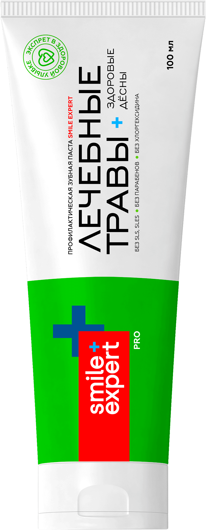
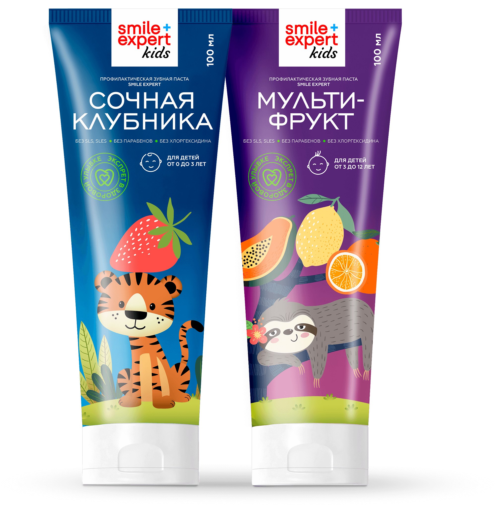
The new design of the toothpaste tube meets modern requirements, as well as the objectives and goals of the brief. The design is highly appreciated by the client’s expert commission.
package design


new series design
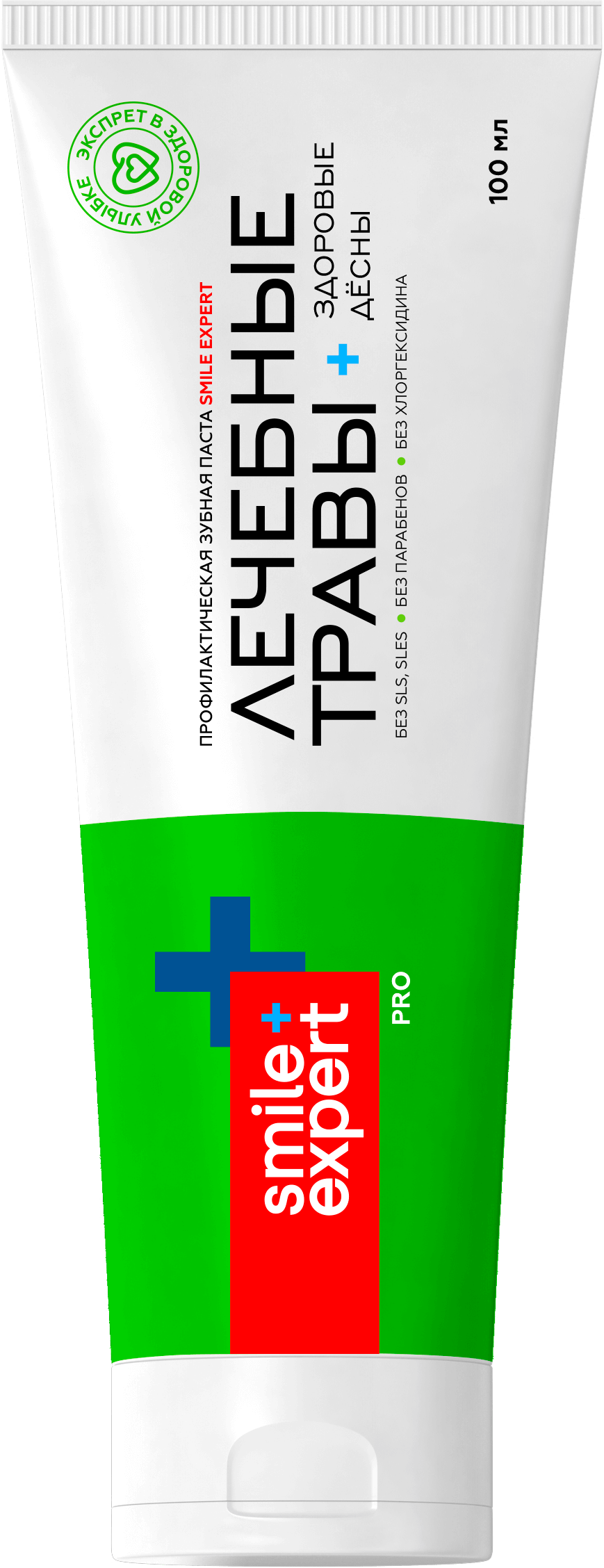
PRO series
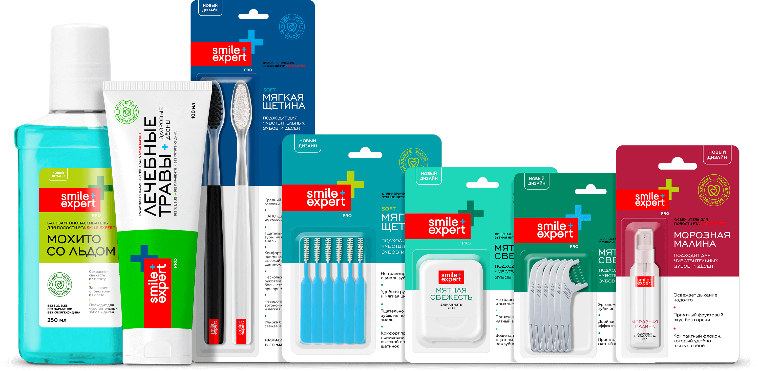
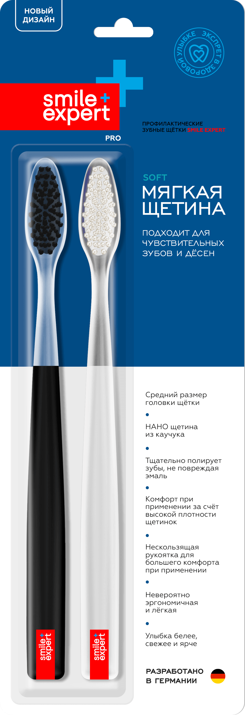
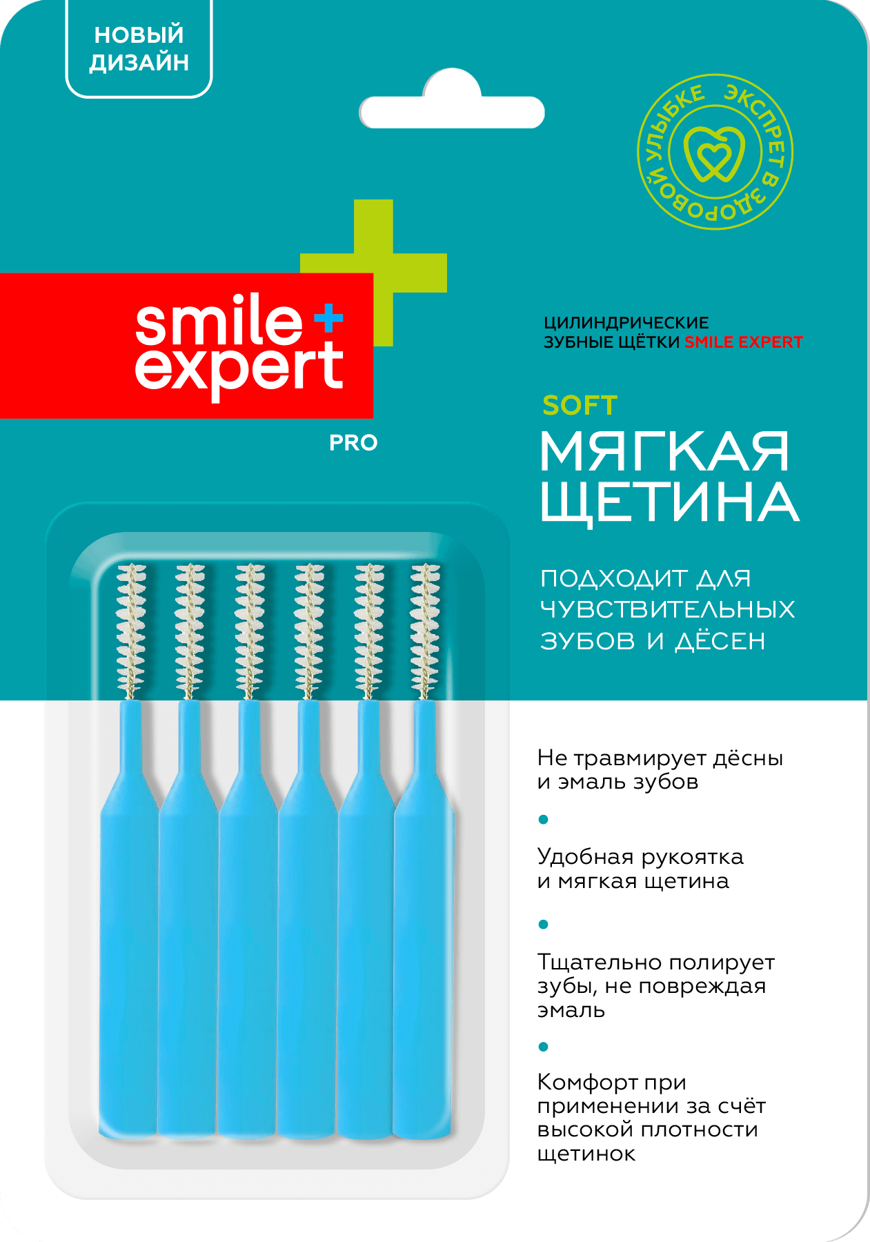
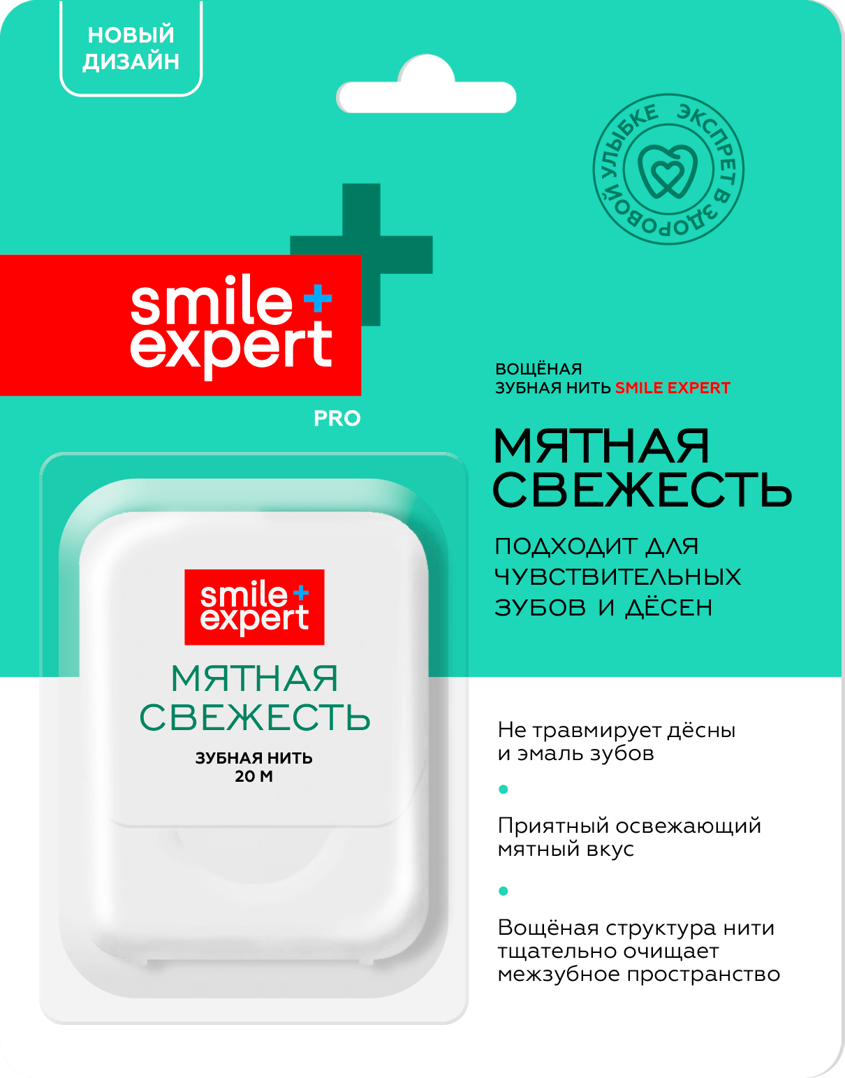
A differentiated color palette was created within the framework of one product line. It maintains the general principles of composition. Thus, we motivate the consumer to "collect" all products in the line and stimulate additional purchase. As part of an advertising campaign, it is recommended to use the pictures of all products in the line on the promotional materials.
The design does not use images such as "grass", "leaves", "molecules", "crystals", "shells" and so on. The PRO line features an uncompromising minimalist design with a vibrant and vital color scheme. Color contrast and nuance are used both within one package and between packages of the whole line.
Differentiation of tastes within the SKU is planned through the introduction of additional colors, which will inspire the consumer's collecting urge. At the same time, the logo must maintain contrast in color or lightness in order to serve as the main visual tag.
The white part of the package highlights the key benefits and additional options of each product. It is not recommended to use additional graphical elements in this space. For an advertising campaign, we recommend using compositions that are not overloaded with elements, creating packshots through studio photography or 3D modeling.
KIDS, ECO, AGE series
The product line for children uses friendly characters for visual "flirting". Maintaining the principle of strong contrast, the packaging includes a rich color palette. Characters can be designed individually or adapted from photostocks. We do not recommend using cliché characters such as baby elephant, dolphin, whale, bunny or beaver.
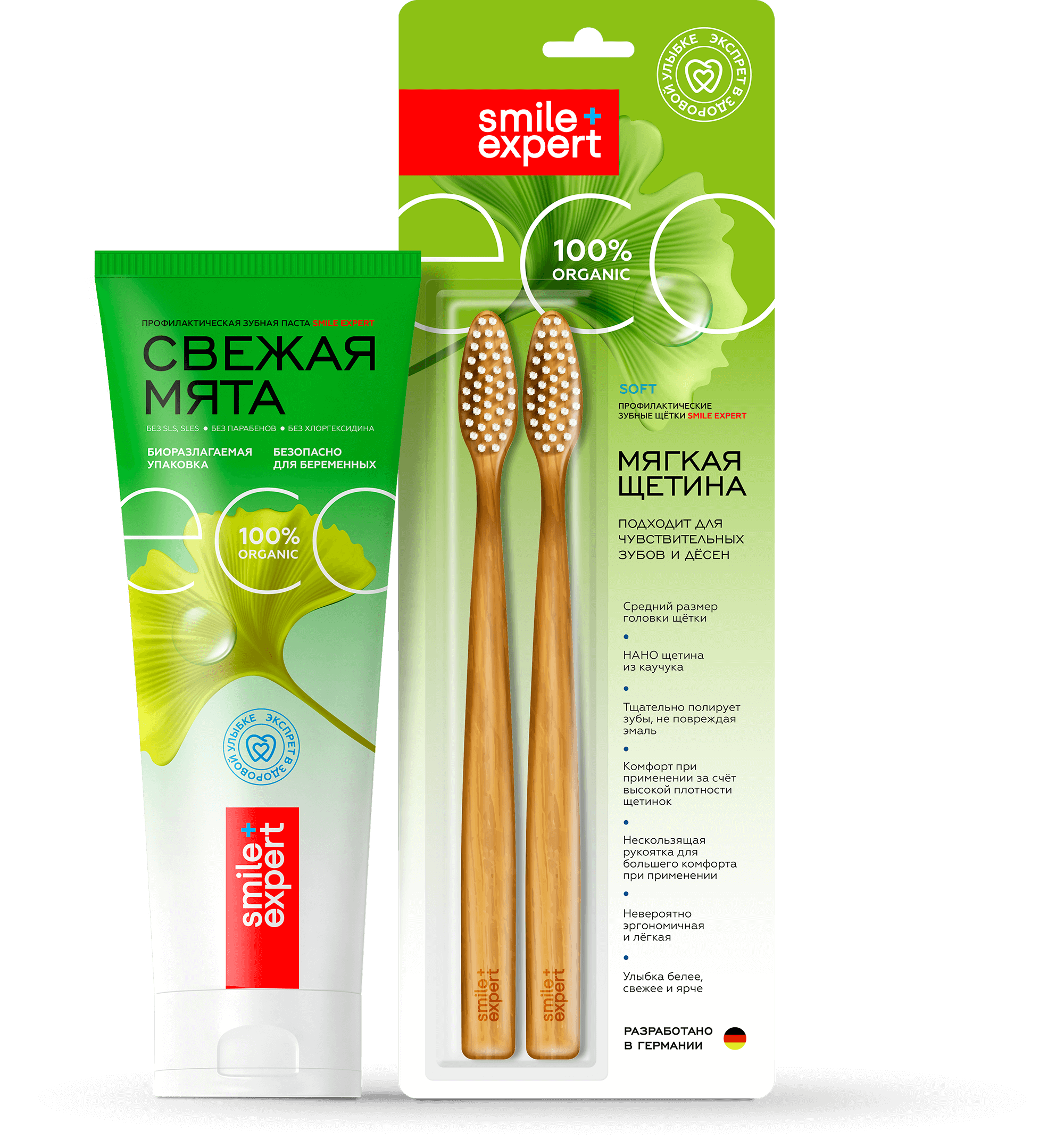
The ECO line refers the consumer to nature and natural colors and maintains the inherent principle of visual contrast. We recommend developing the line using “warmer” shades of green (light green, yellow-green, seaweed, and so on). It is acceptable to use the same graphic style for different products in the line.
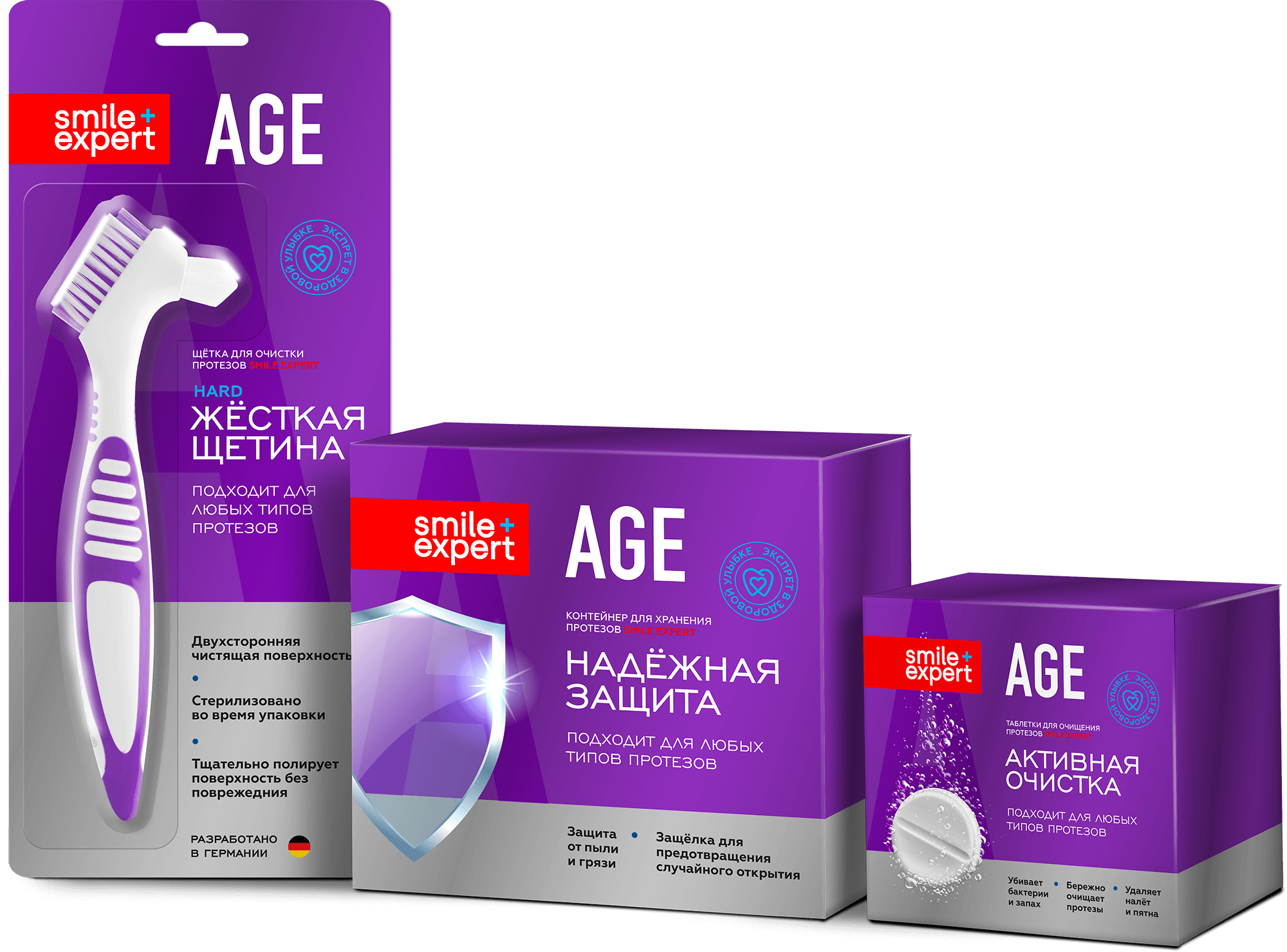
The series is characterized by a universal design style using an identical composition and color palette for all products. Instead of a white space with a list of benefits (as shown in the PRO line), we provide a matte silver foil background with a slight metallic sheen. At the same time, the packaging uses a larger font compared with the other product lines. The large color spot of the package is designed to speed up the search for goods on the shelf, and the purple hue, unusual for the industry, enhances associativity and memorability. For the AGE line it is inappropriate to use the "collectible" principle, therefore it is permissible to use additional graphic elements on the package (pill, shield, drop, beam, and so on).
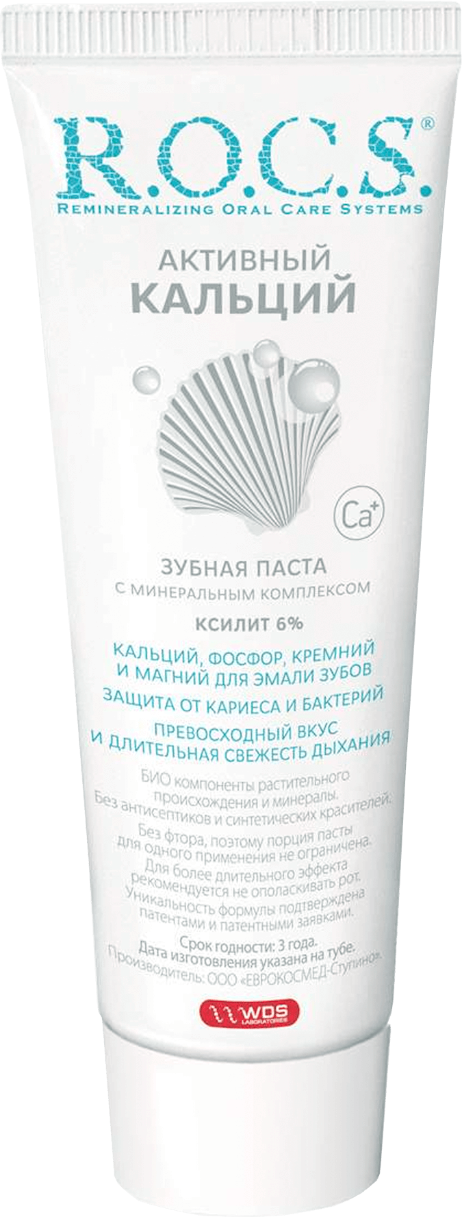
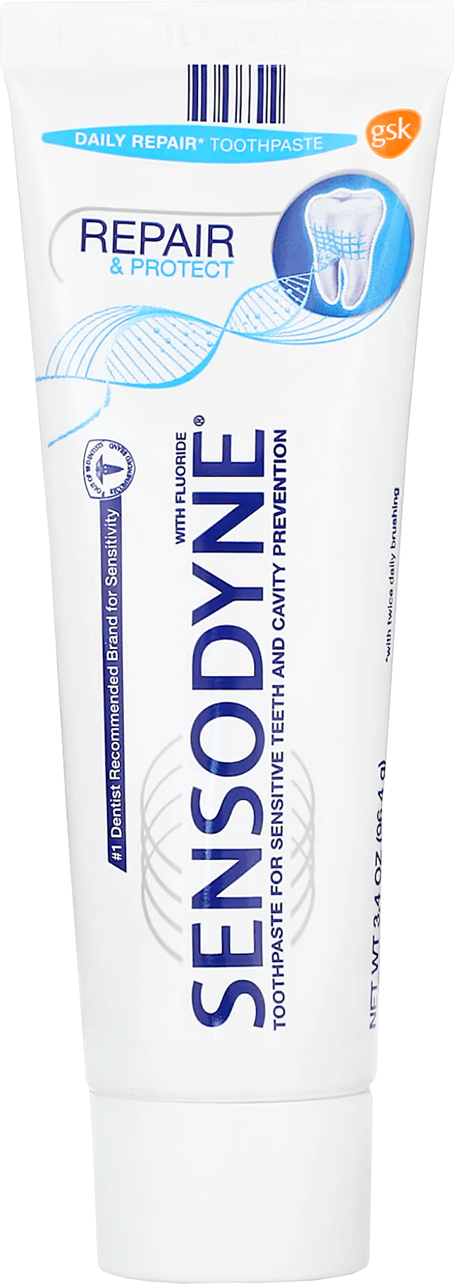
comparison
A large amount of white; the packaging is oversaturated with information and small text; poverty of the color palette; outdated illustrations.
A large amount of white; the packaging is oversaturated with information and small text; poverty of the color palette; lack of visual tags.
Good color contrast using visual tags; stable composition with symmetry; structured information.
A strong competitor; good color contrast; moderation of information; outdated illustrations; unstable composition with a collapse to the left.


A large amount of white; a huge dominant logo; poor color palette; there are no good visual tags.
Key Visuals


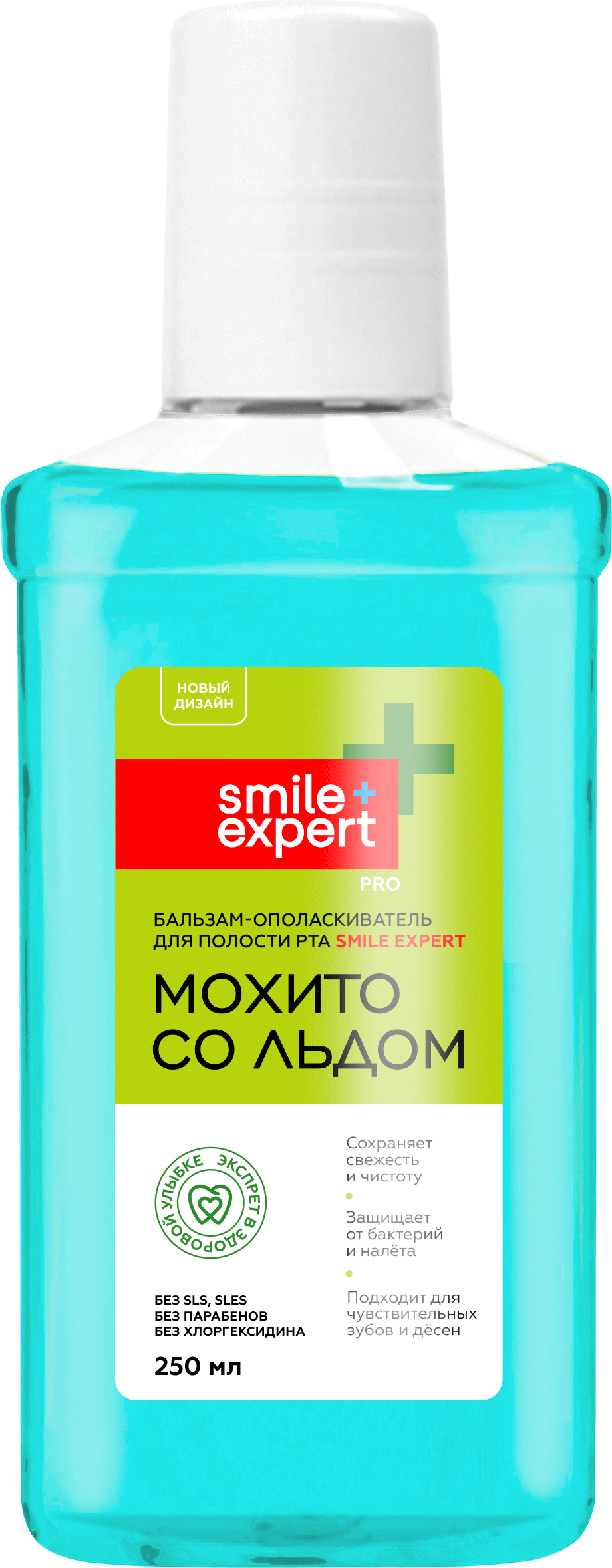
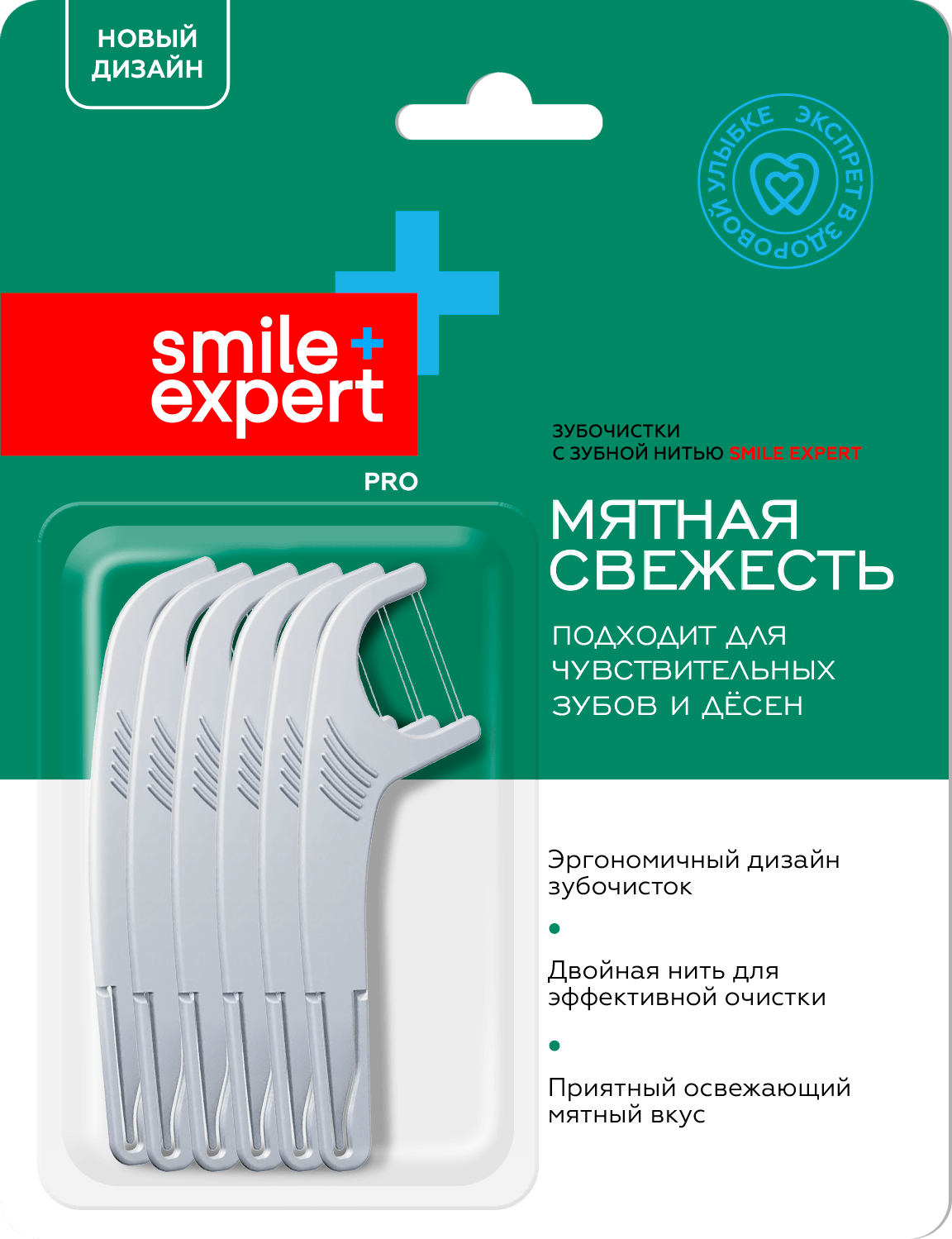
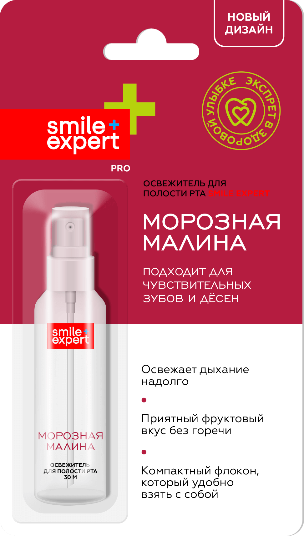

oral rinse
toothbrushes
dental floss
interdental brushes
floss picks
mouth freshener
toothpaste

At the beginning of this page, there are excerpts and quotes from the client's brief, which describe the task in detail. This is a large-scale project for creating a unified design system for each product line. It was very interesting to work on the design of a toothpaste tube, including the technological aspect, taking into account the requirements for production. This task was carried out as part of the tender offer, but was not selected by the client’s special commission. However, focus group studies conducted by the marketing department showed high consumer interest and emotional response, which allowed our company to enter the list of contractors and implement other projects.
Brand Strategy
Brand Identity
Art Direction
Concept
Naming
Copywriting
Visualization
Packaging
Content Strategy
Prepress
Brand Identity
Art Direction
Concept
Naming
Copywriting
Visualization
Packaging
Content Strategy
Prepress