© 2014-2023 Aliaksandr Drozd


A collection of flavors of the wild nature. Harmless compositions, bright taste, a new gastronomic experience.


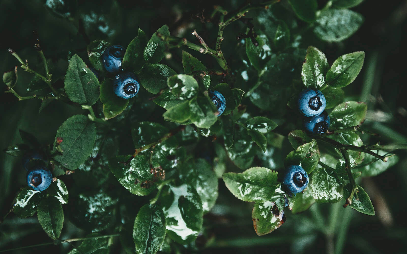
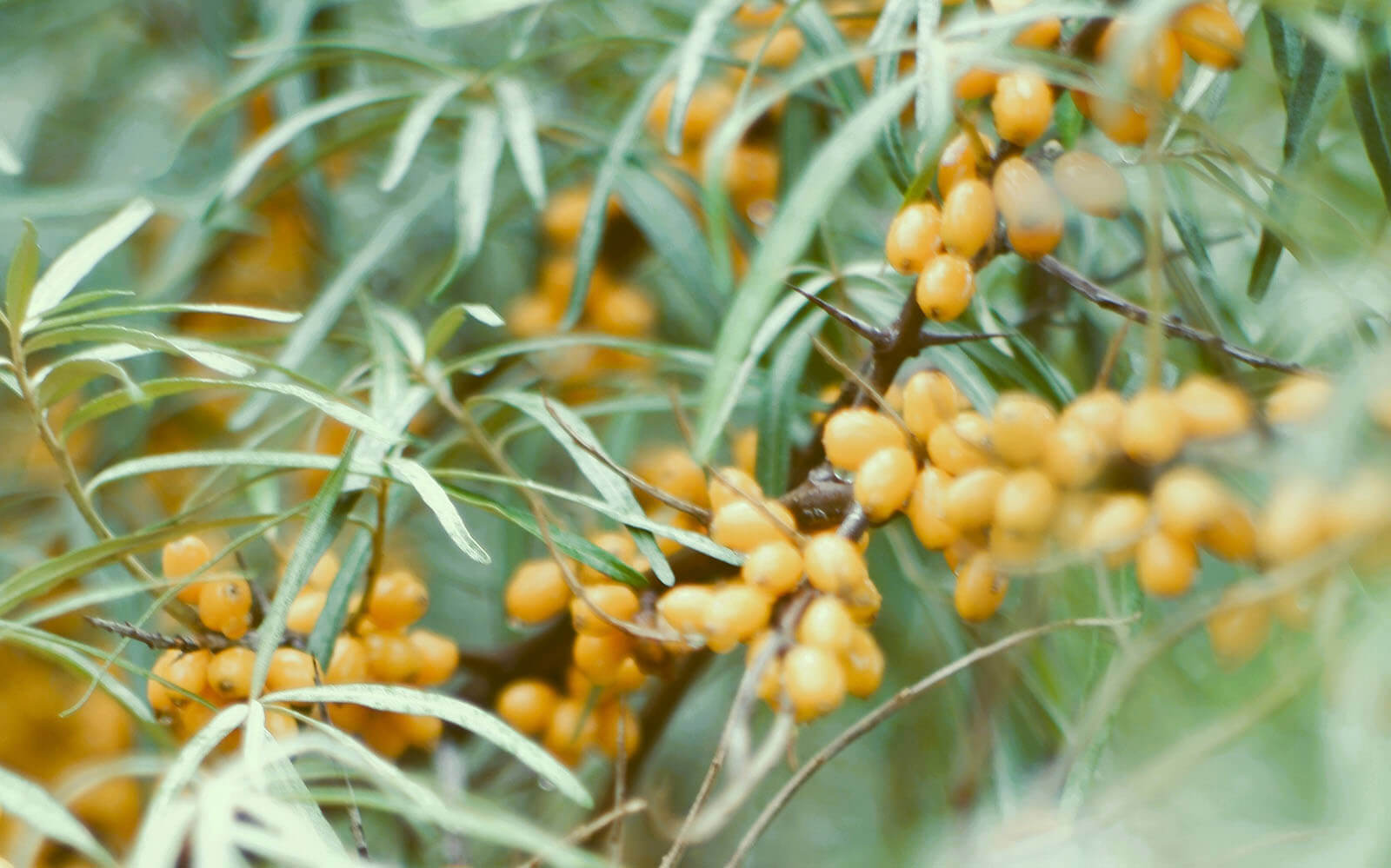


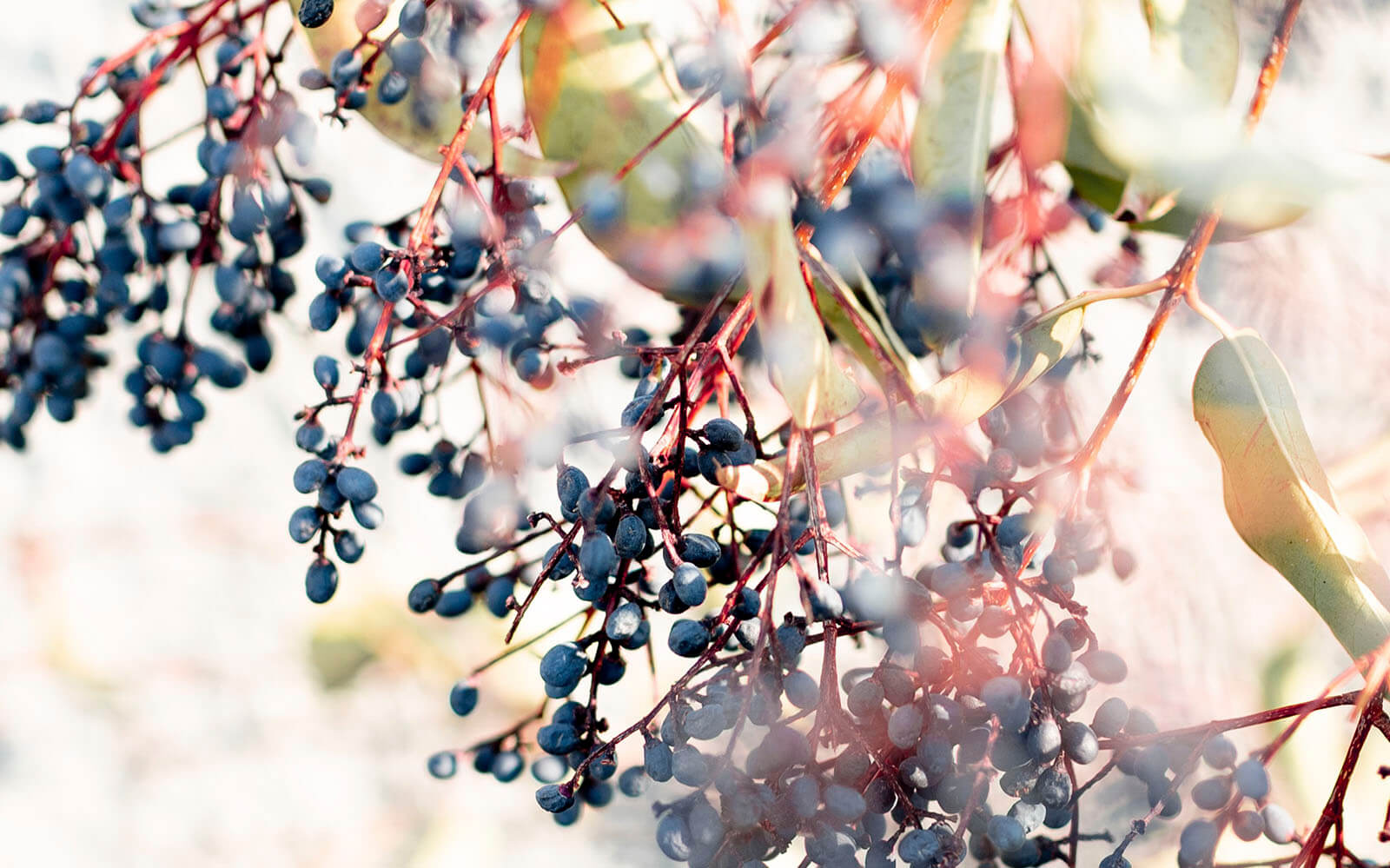

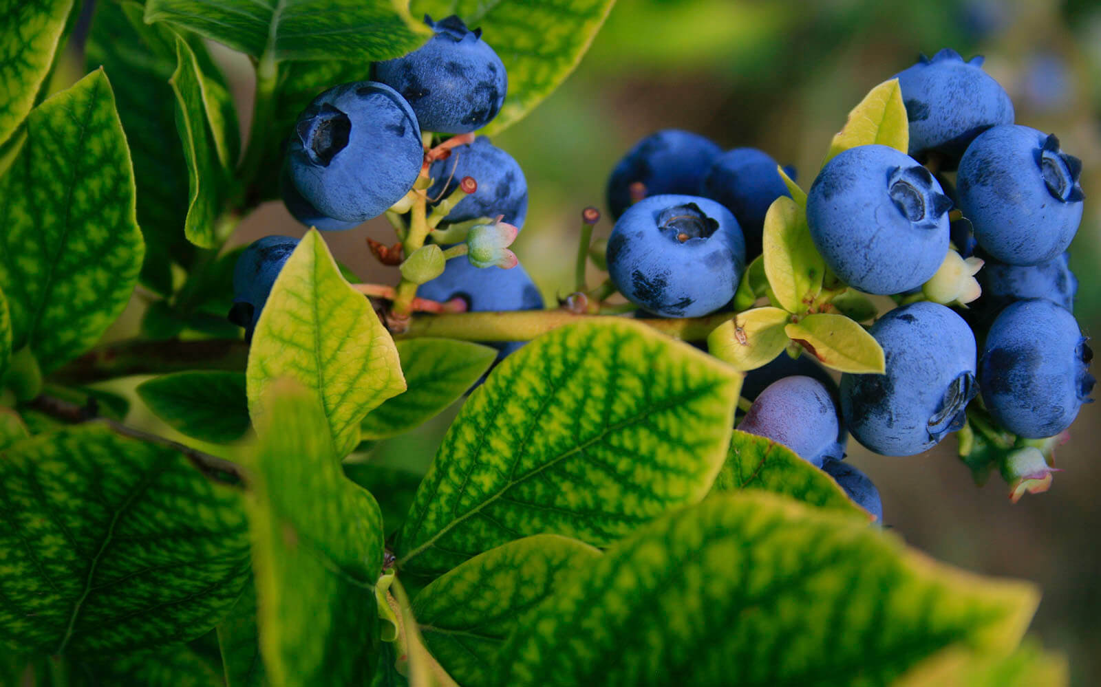

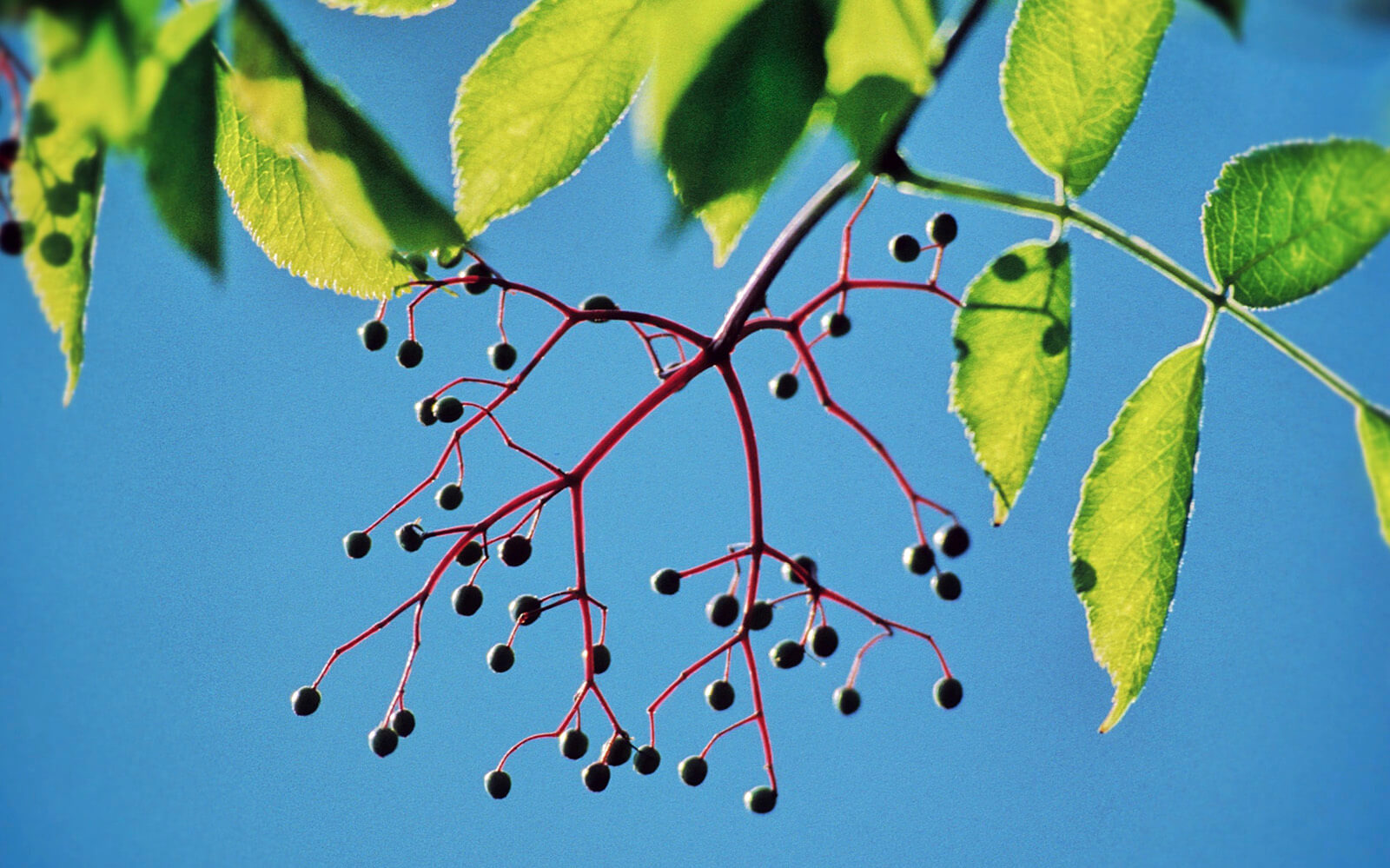


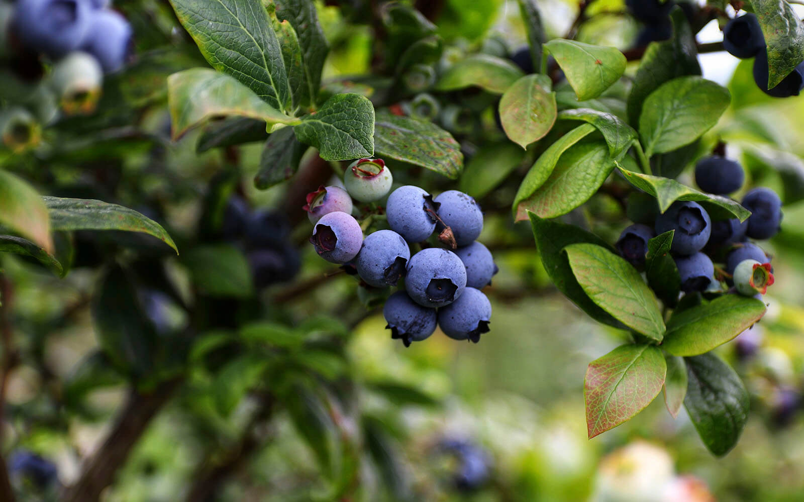
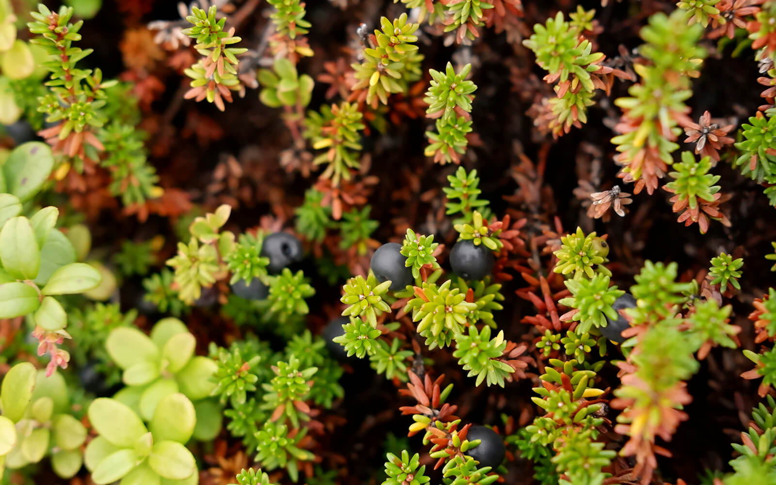
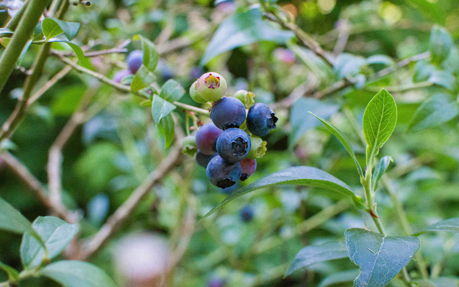


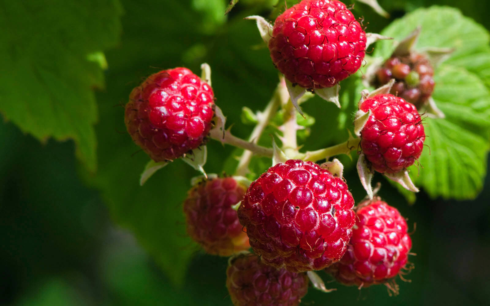


After being harvested, the berries are subjected to rapid freezing and subsequent sublimation, thereby, they retain their structure and all the useful properties. Herbs are dried carefully and slowly that allows them to preserve their aroma.
The brand was created to share out the primeval energy of the forest, the real power and taste of wild nature with the megapolis’ inhabitants. Try an extraordinary gastronomic experience and expand your taste horizons with gväla.
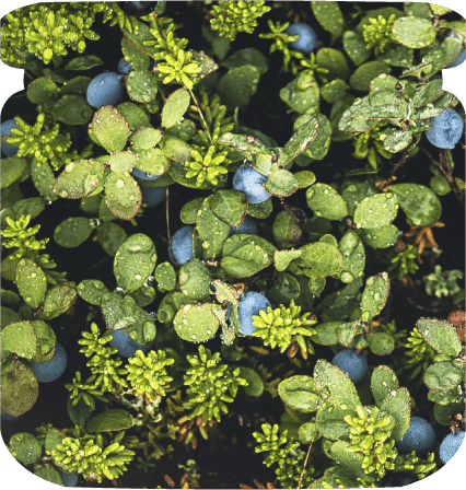
Nature has flavor!


basic series
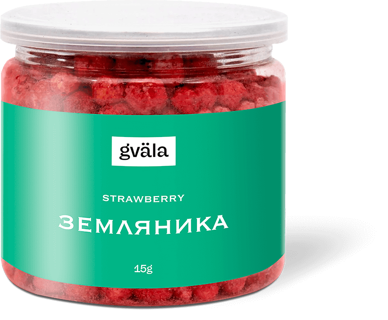
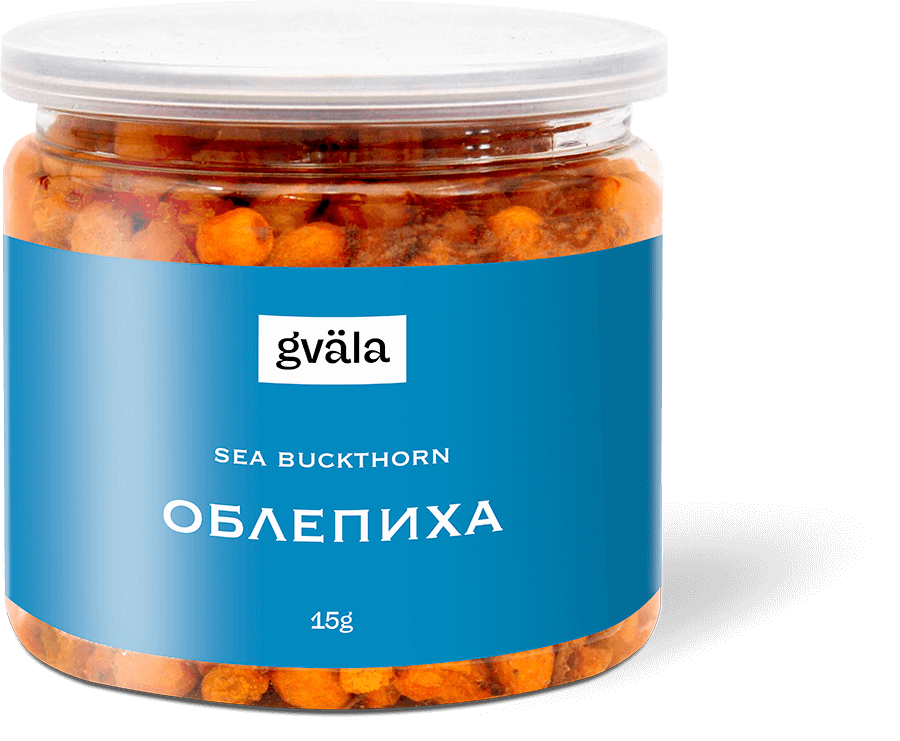
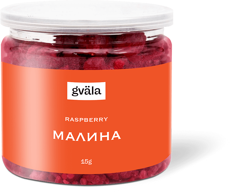
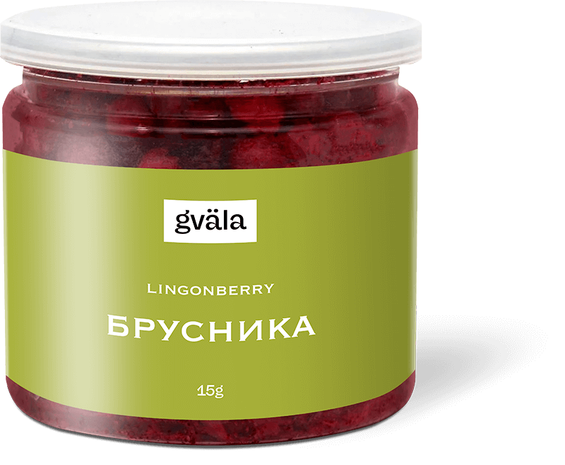
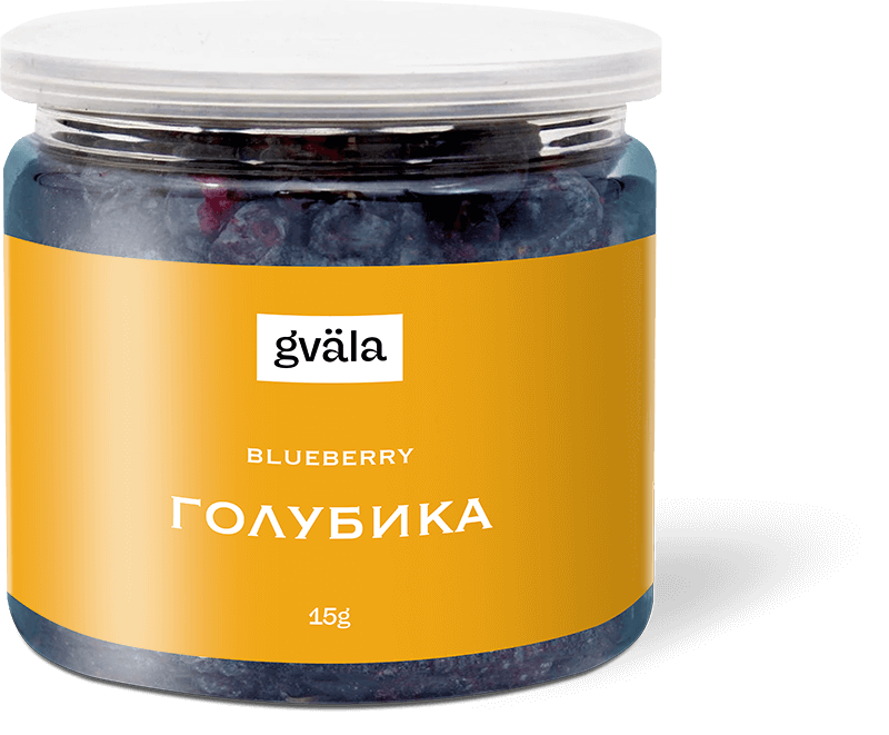
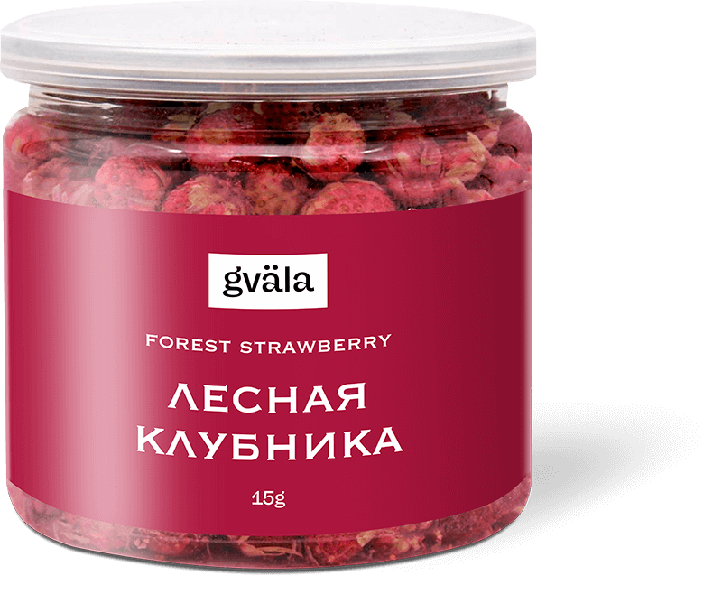
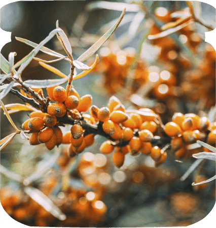
The company's staple is freeze-dried wild berries picked by local villagers. A bright label with a white font in a minimalistic style has been created according to the client’s brief.
Berries contrast with the bright packaging, creating a surprisingly attractive product line that you want to buy. With the help of the color, it is easy to anchor the consumer's preference for a particular type of berries.
herbal series
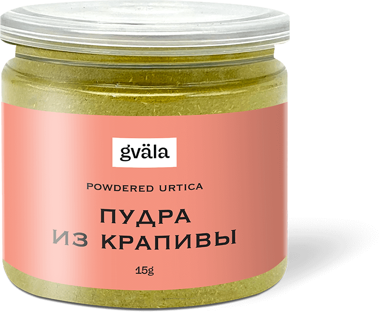
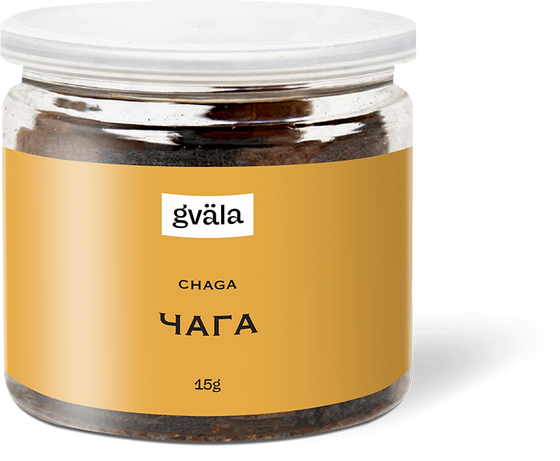
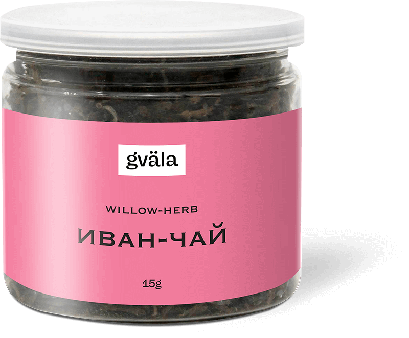
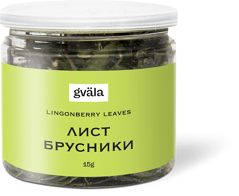
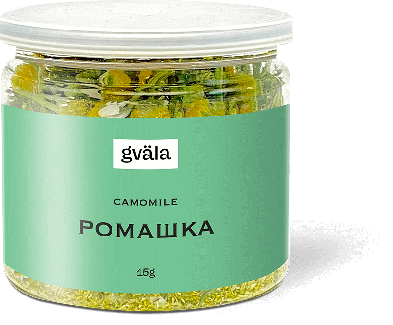
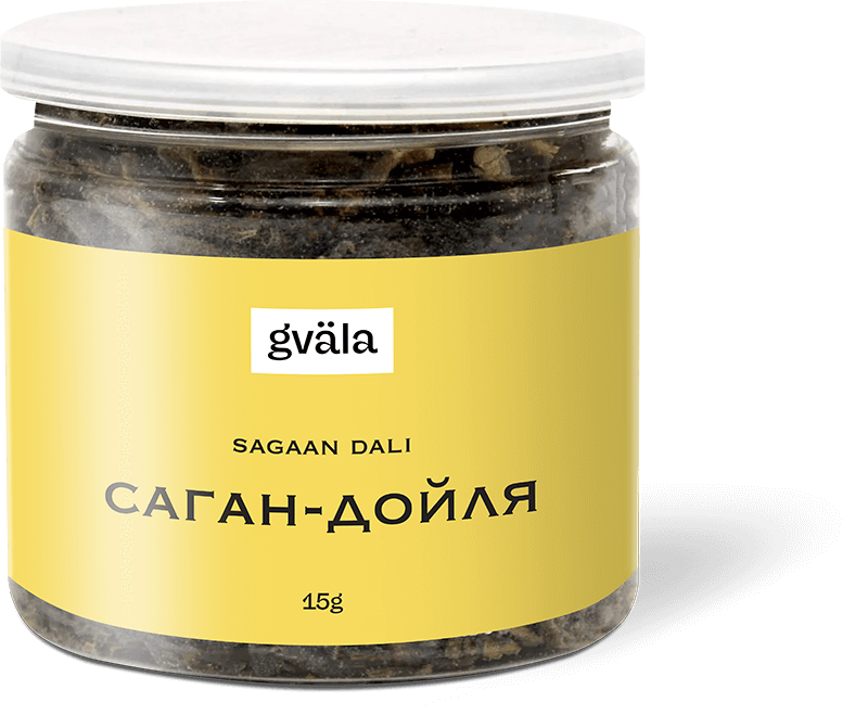
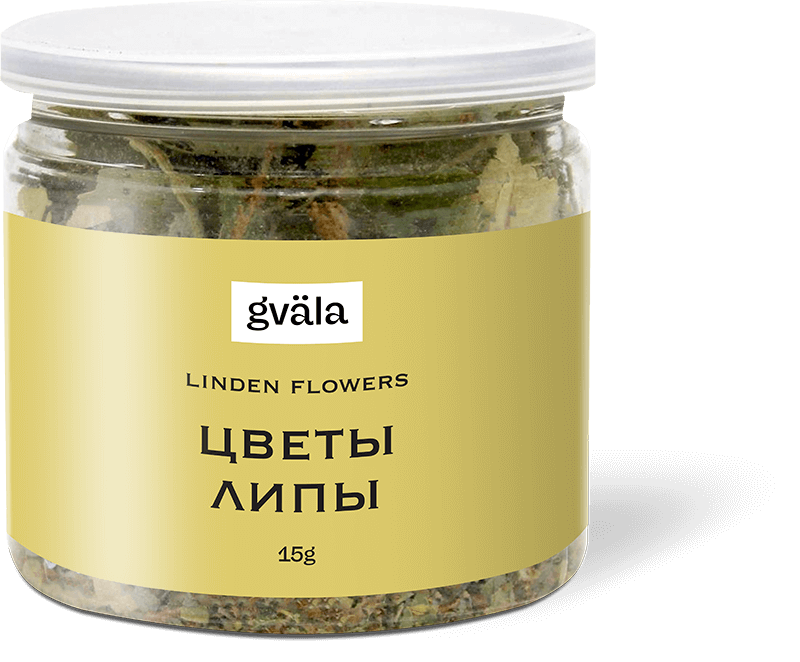
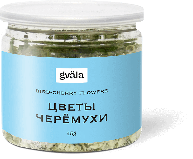
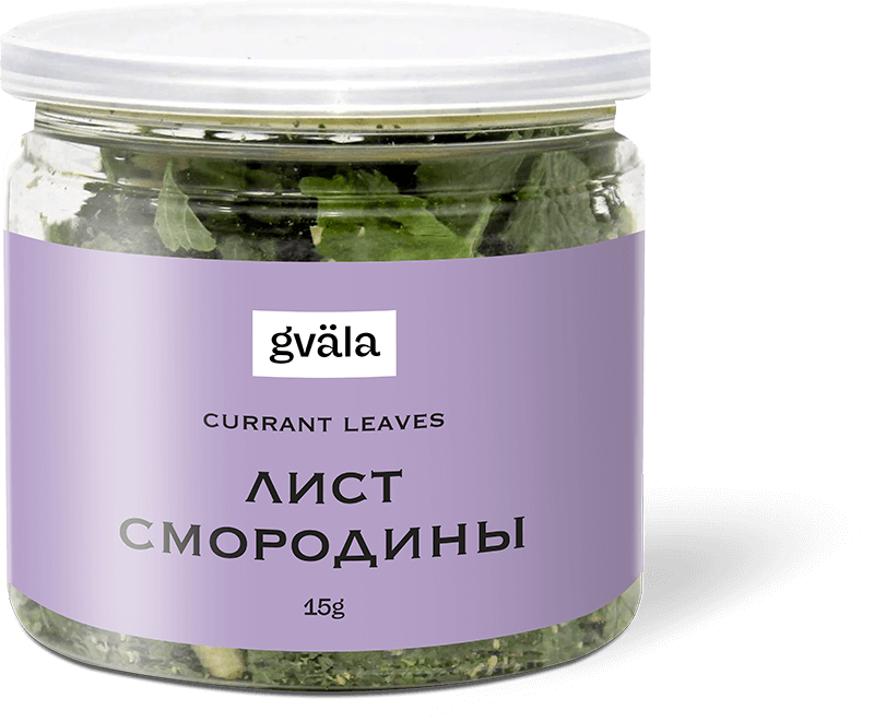
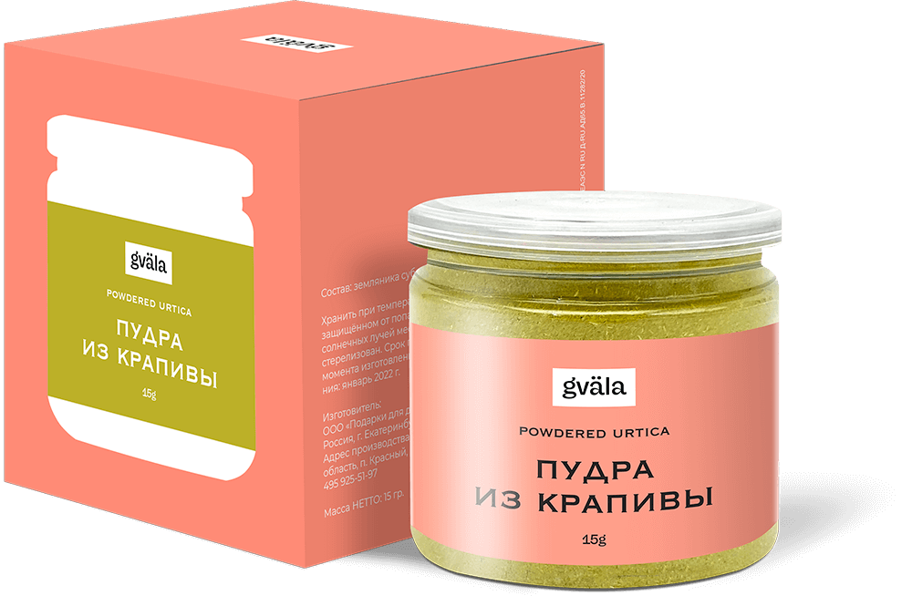
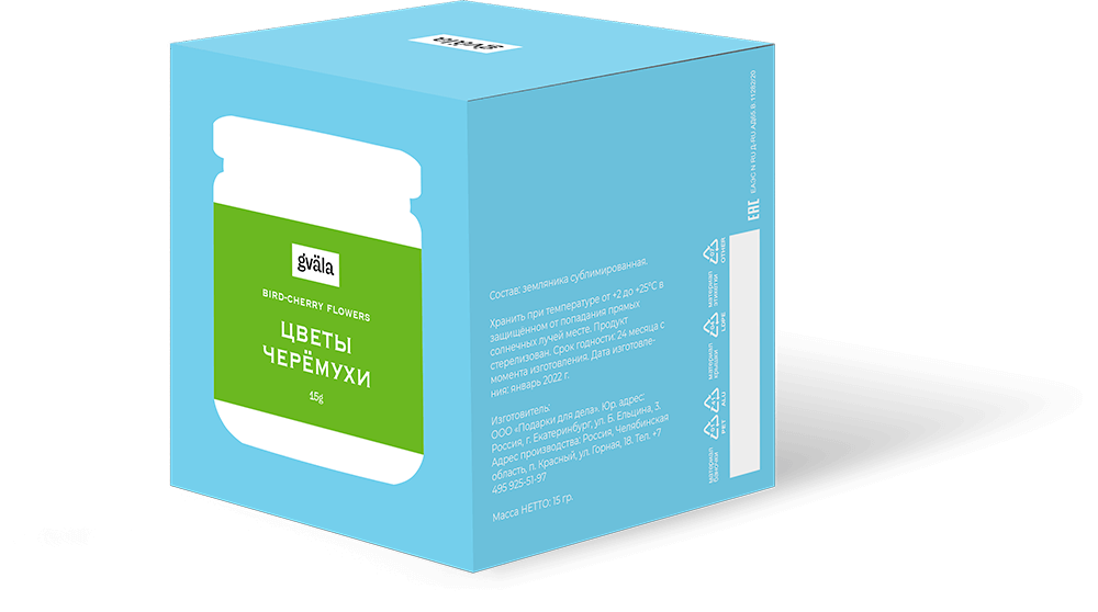
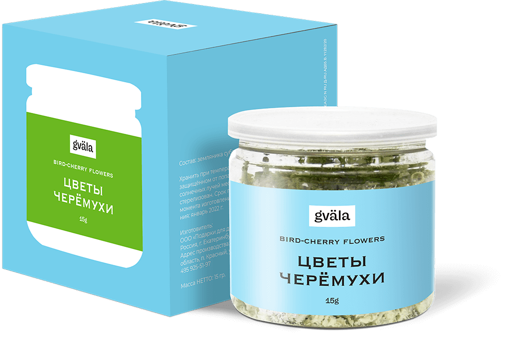
Another important product line is useful curative herbs and leaves. For this series was used a label with a delicate pastel background and a contrasting black font on it.
Dried herbs and leaves have an inexpressive dark green color, so the colored label decorates the jar with the product and makes it attractive to the consumer.

a-la russe
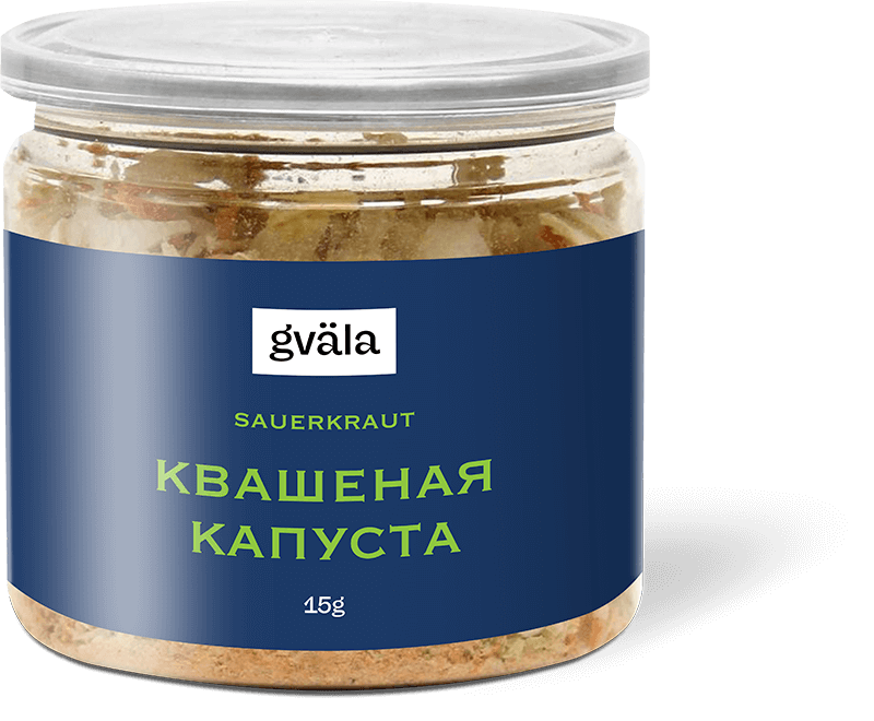
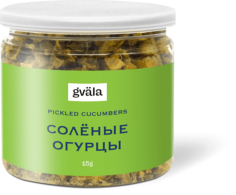
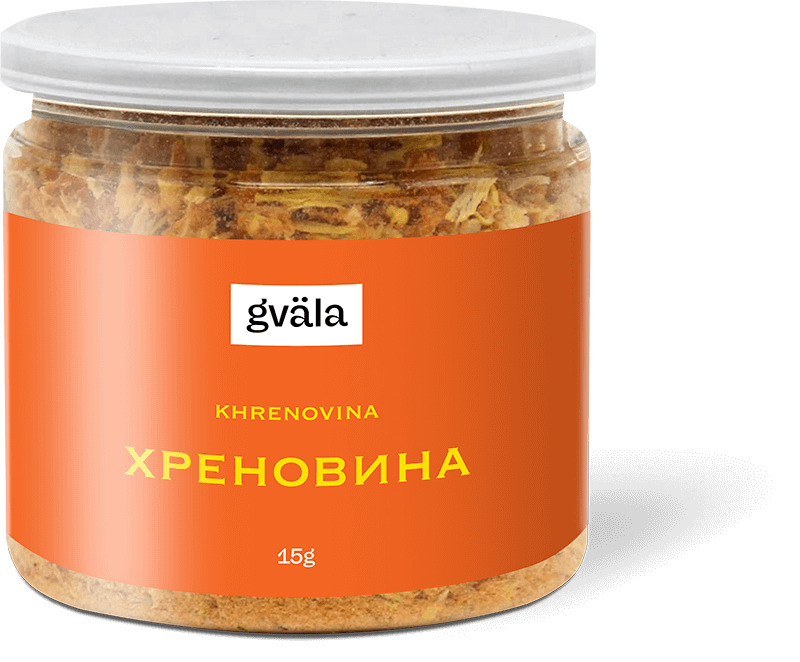
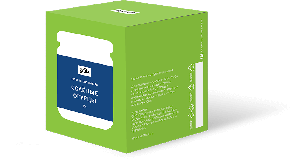
A set of three products in Russian style. It includes such freeze-dried products as sauerkraut, pickles and horseradish. These are traditional Russian flavors that will always be at hand as dish seasoning.
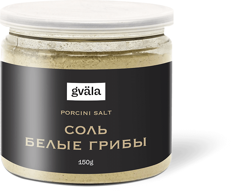
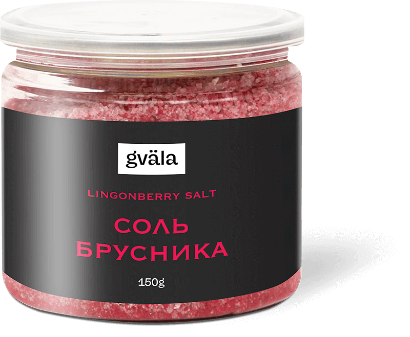
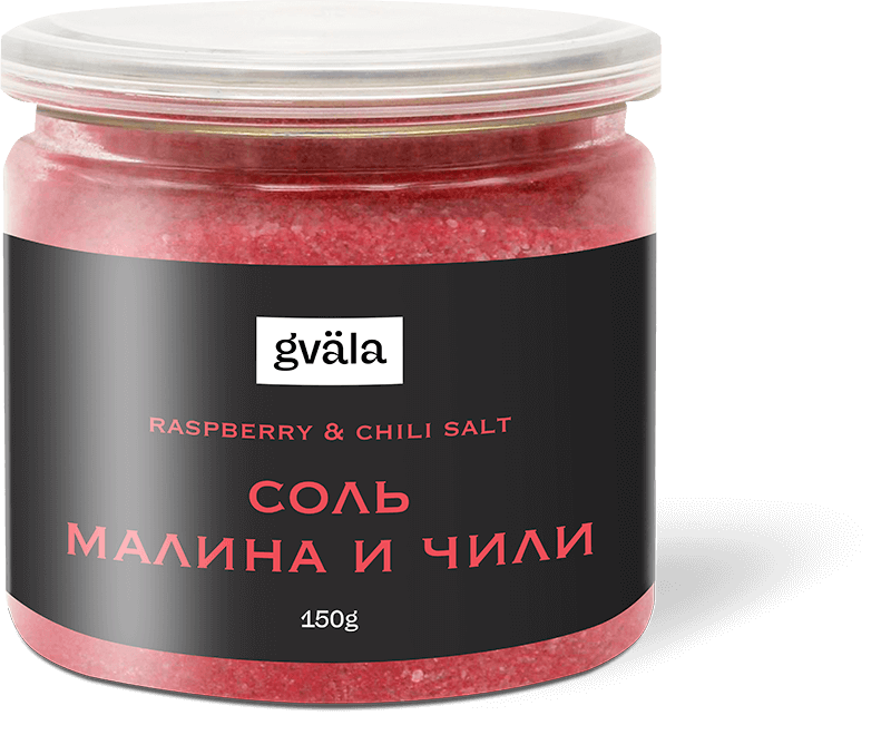
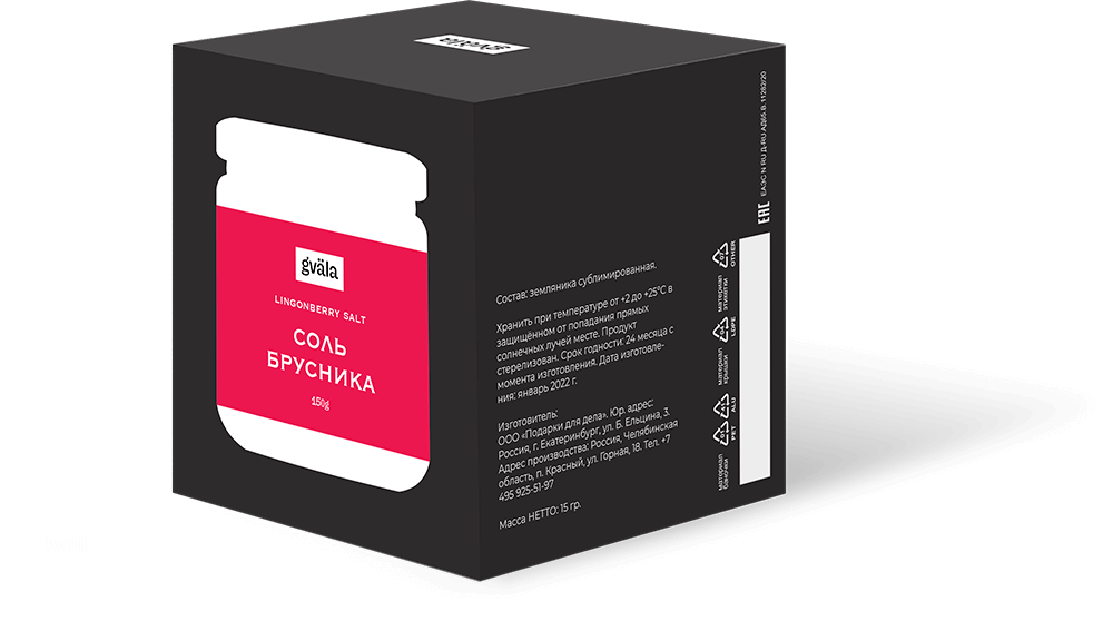
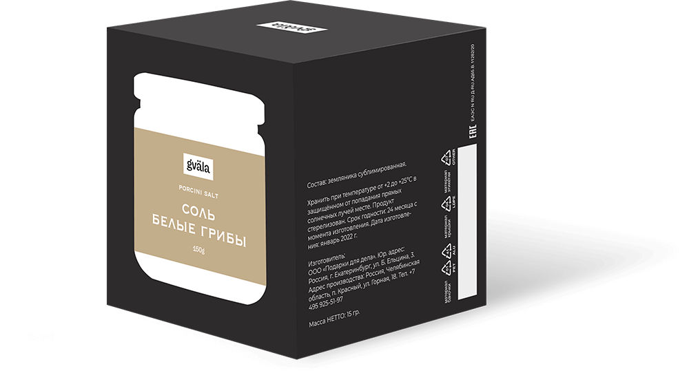
The original combination of salt and berry powder will give any dish a special piquancy and unusual taste. The product consists of fine salt mixed with powdered porcini mushrooms, lingonberries or raspberries with pepper.
salt
chocolate
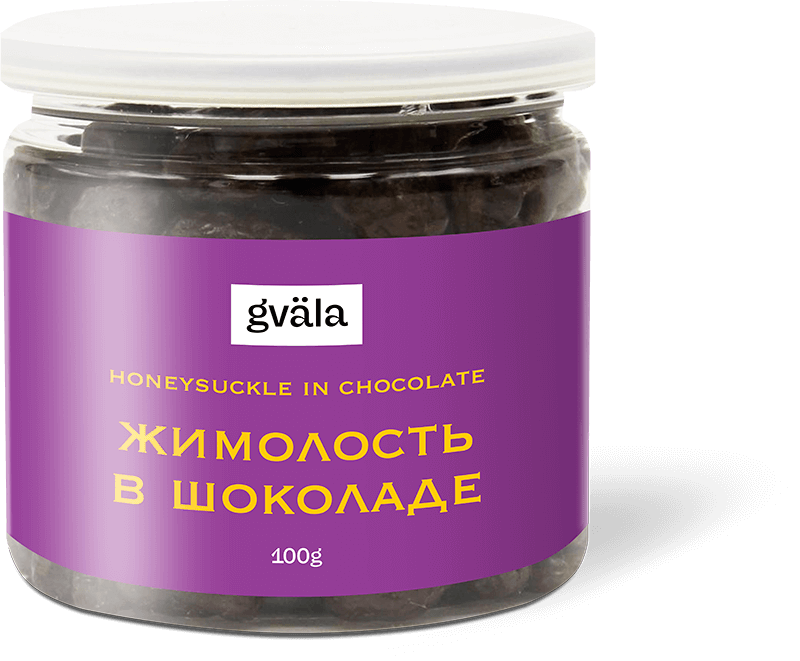
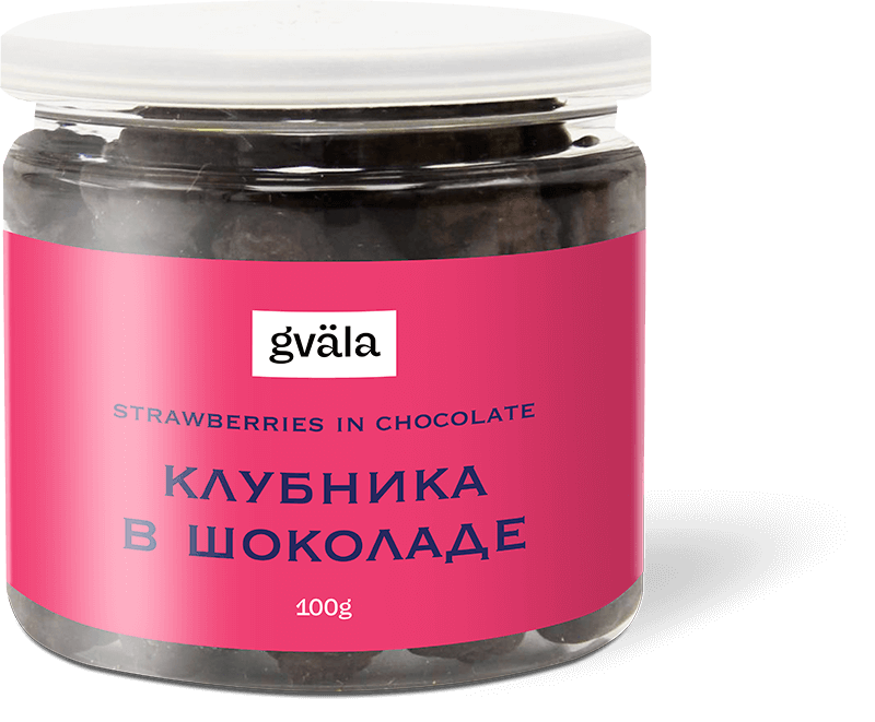
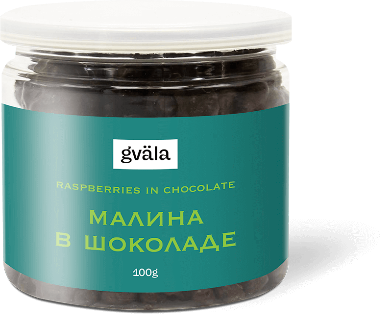
Berries and nuts in chocolate glaze are a sweet treat for children and adults. The combination of sourness and sweetness makes this product original in flavor. The bright label only emphasizes the unusual bright candy taste.
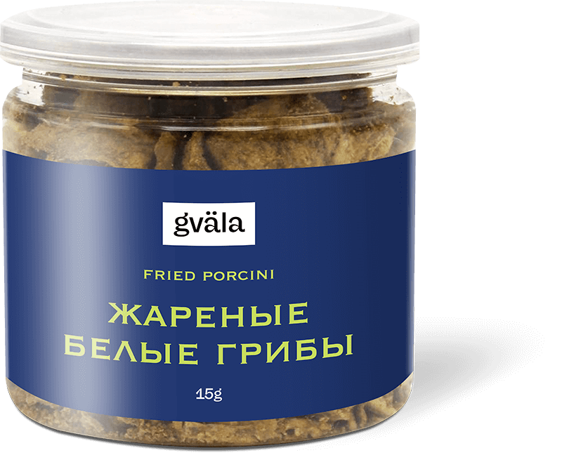
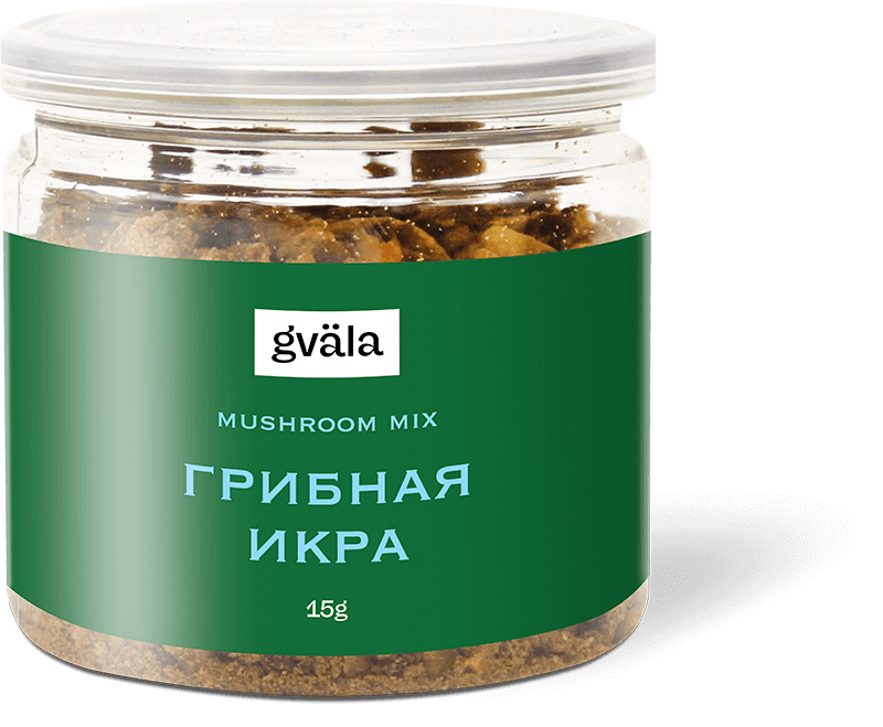
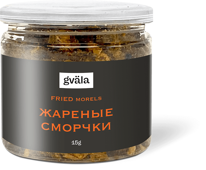
A collection of spices from mushrooms will be a desired gift for gourmets. The condiment can be added both during the cooking and to ready-made dishes while serving. Bright texture and rich taste.
mushrooms
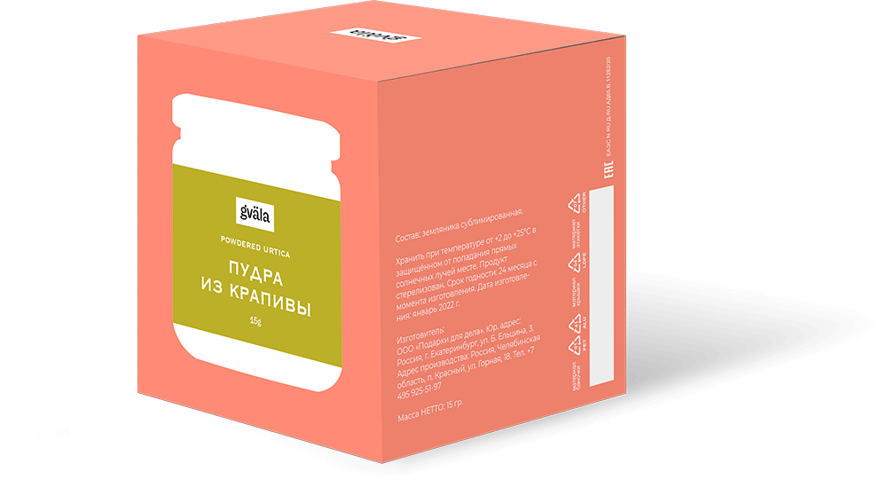
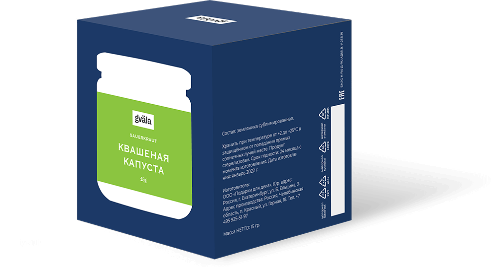
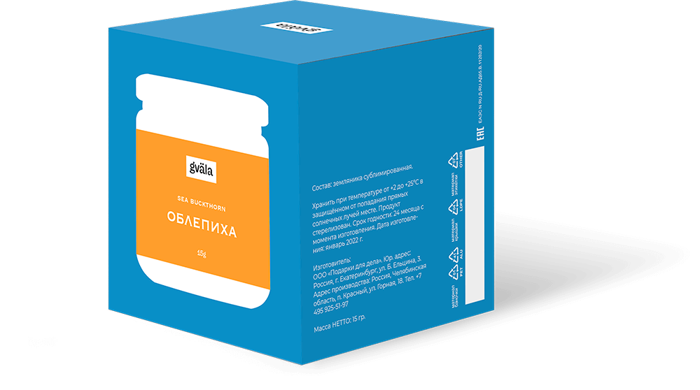

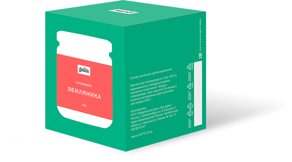




Taste the nature!


I was expected to come up with a name for a new product that has no alternatives on the local market. These are freeze-dried berries and herbs. Unlike dried berries, freeze-dried ones retain their shape and rich taste. The client wanted to convey exactly these two aspects into brand positioning. Therefore, I chose a colored dot as an element of corporate identity, which is also represented in the logo. The circle in this case symbolizes the preservation of form, the bright color is associated with the original taste of the product. In this project, I have realized such skills as naming, logo creation, packaging construction, color coding, layout of labels and packaging, prepress etc.
Brand Strategy
Brand Identity
Print
Concept
Naming
Copywriting
3D-modeling
Visualization
Packaging
Content Strategy
Prepress
Brand Identity
Concept
Naming
Copywriting
3D-modeling
Visualization
Packaging
Content Strategy
Prepress