© 2014-2023 Aliaksandr Drozd



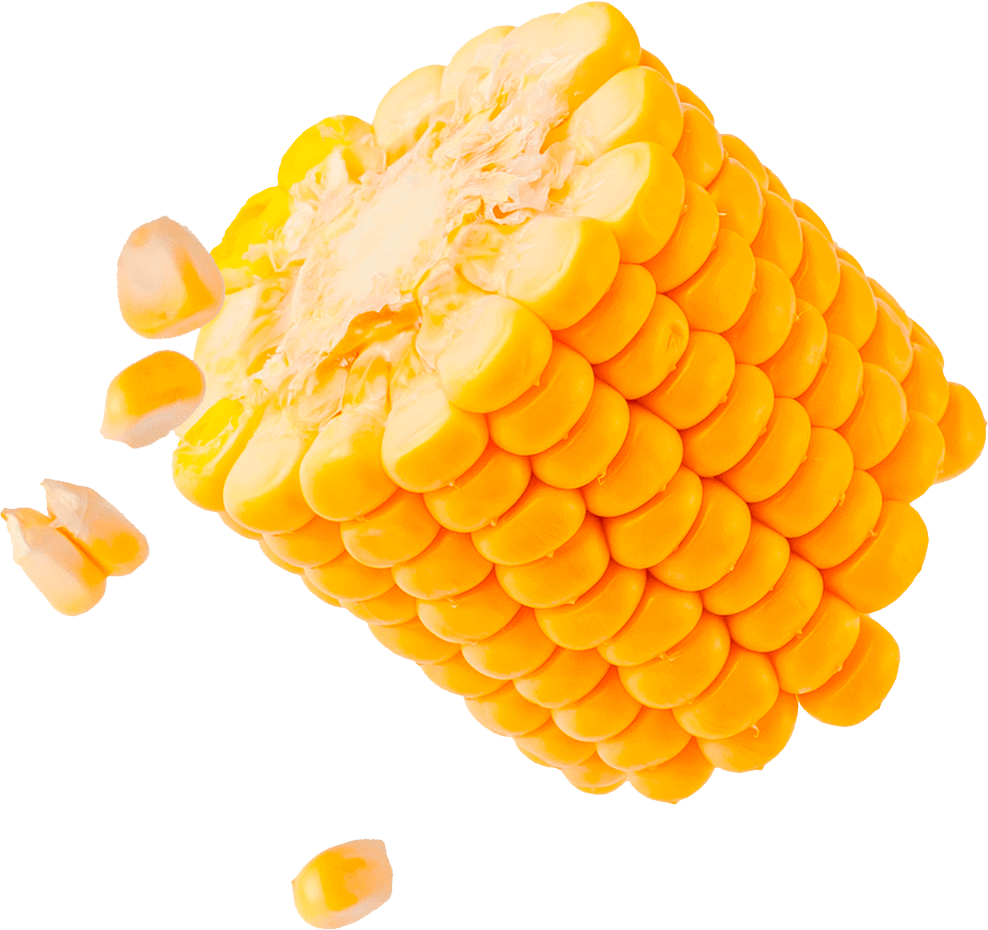
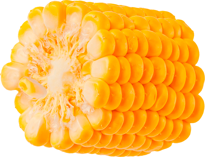





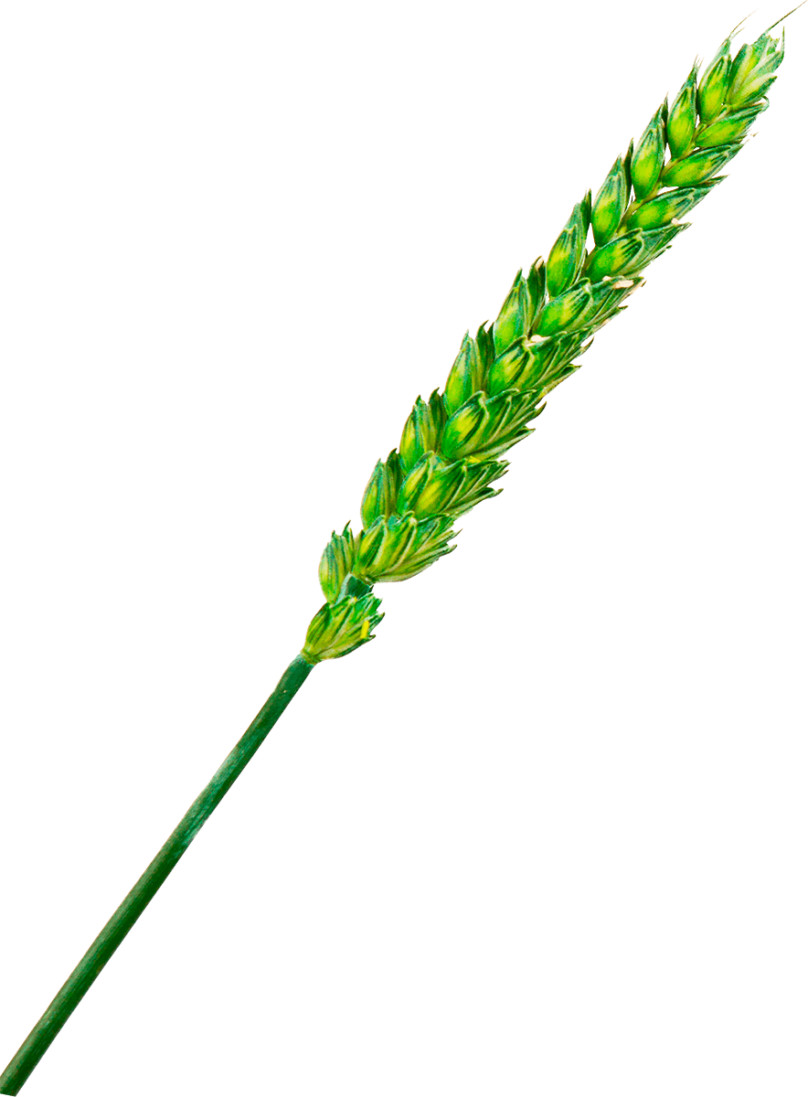
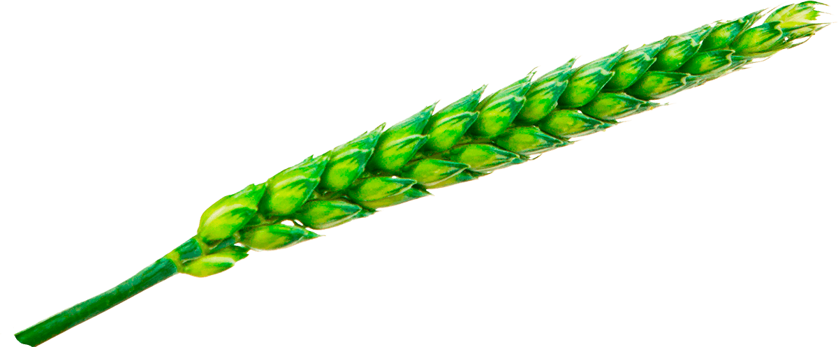
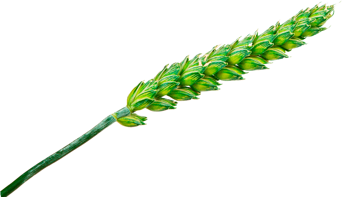
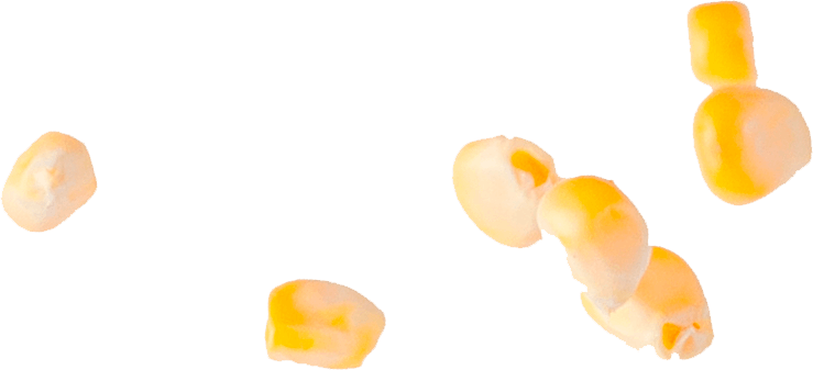
Bayer and KWS established a joint event called The Days of European Agrotechnologies. Both companies help grow sugar beets, rapeseed, wheat, corn etc. The challenge was to combine two companies and four staples with the one graphic style. For each crop I drew icon images from a geometric primitive – a circle. This shape is also part of the companies’ logos, so it wasn’t chosen accidentally. In order to create a unifying pattern, I combined four plants in a random order until I got a harmonious composition. Parts of a circle were also used as elements of the logo, and each plant was assigned with a color. In this way, I discompose a complex graphic image into the basic primitives, and then reproduce the original plant in a new visual format. First, I split, and then I combine.

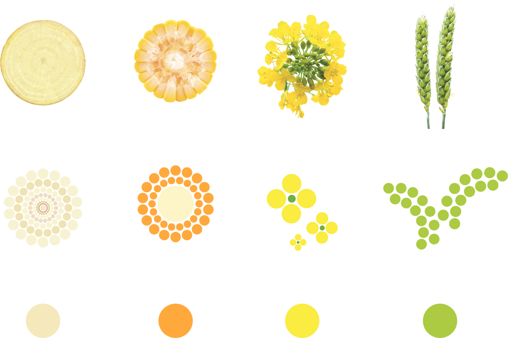
sugar beetroot
corn ear
canola flower
wheat earns

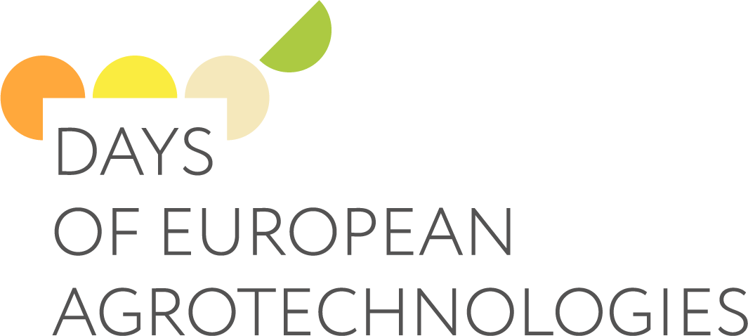



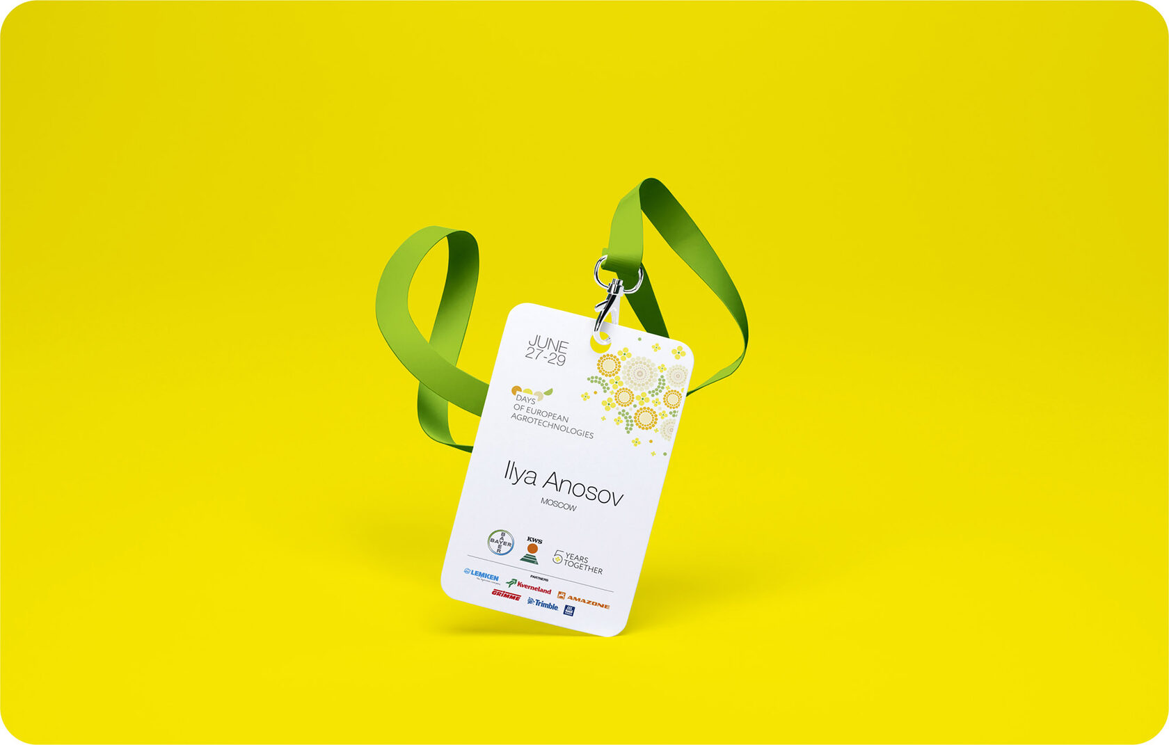
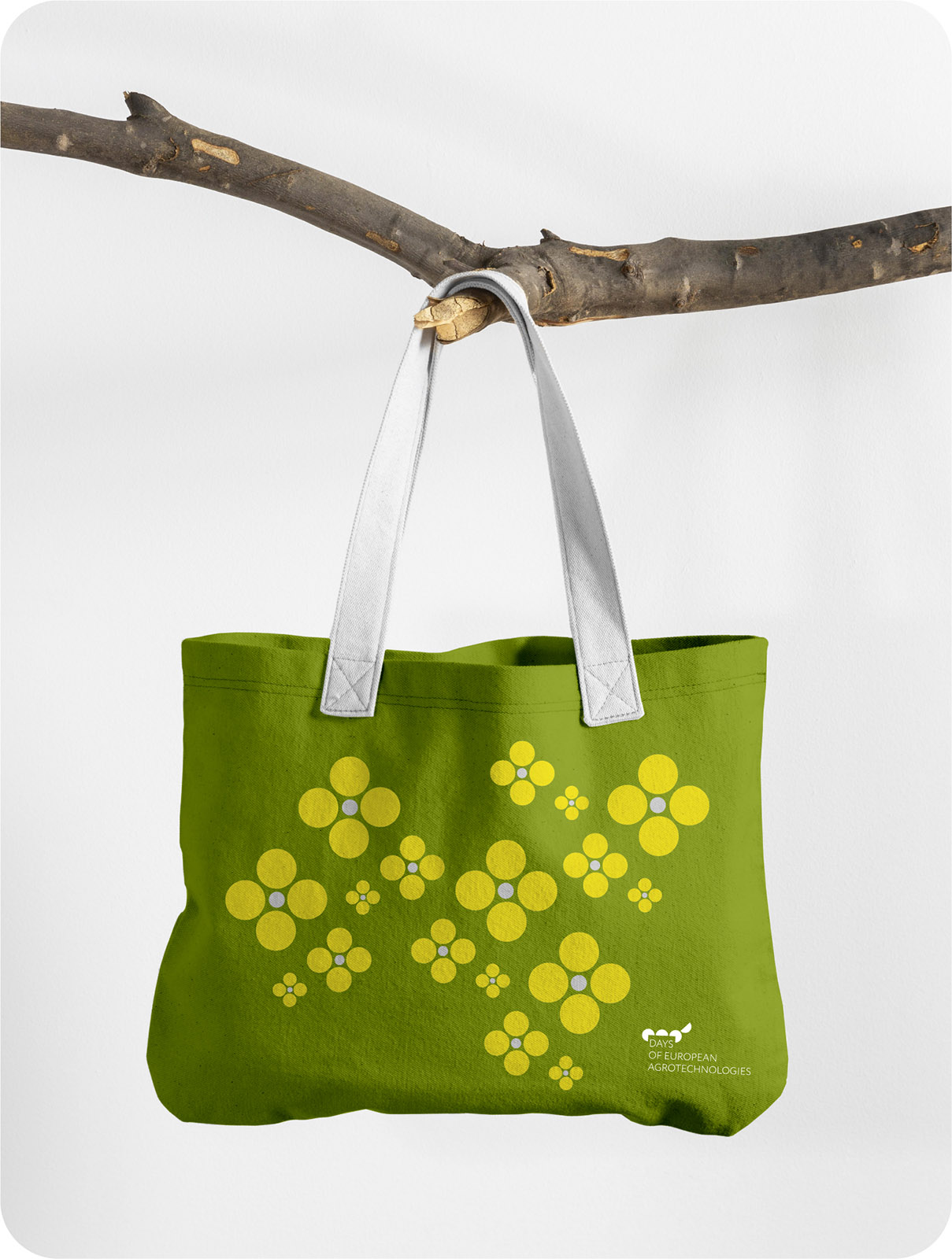
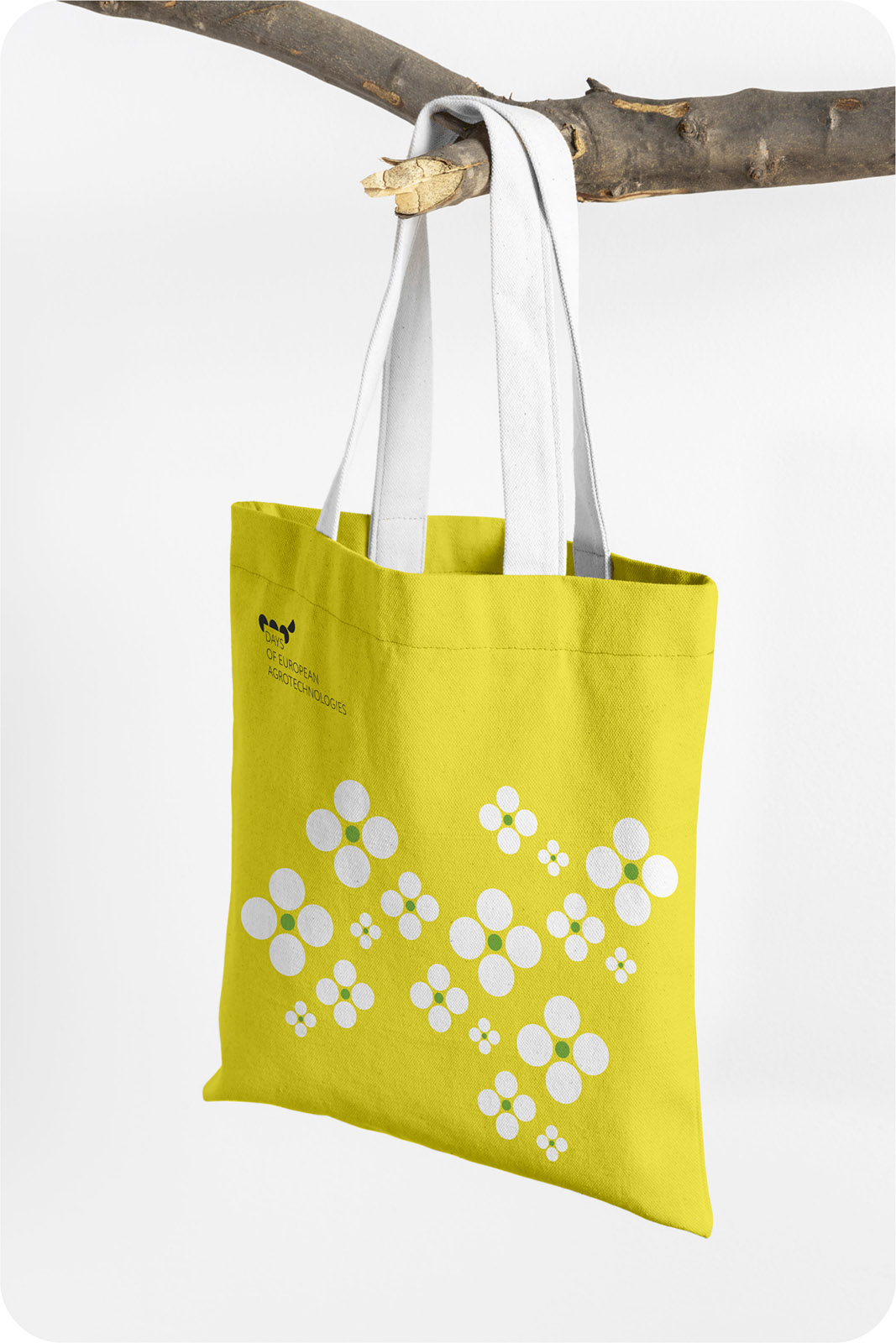
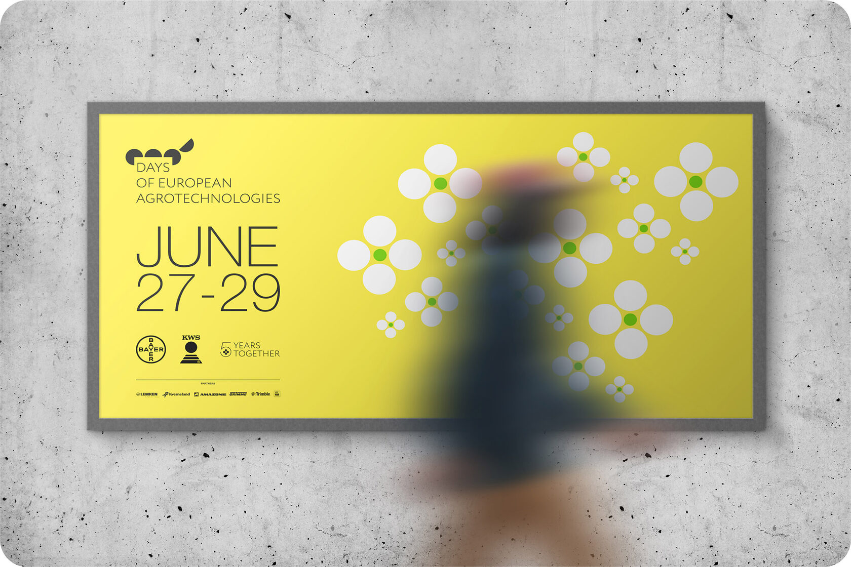



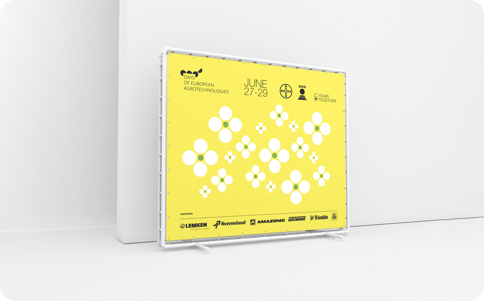
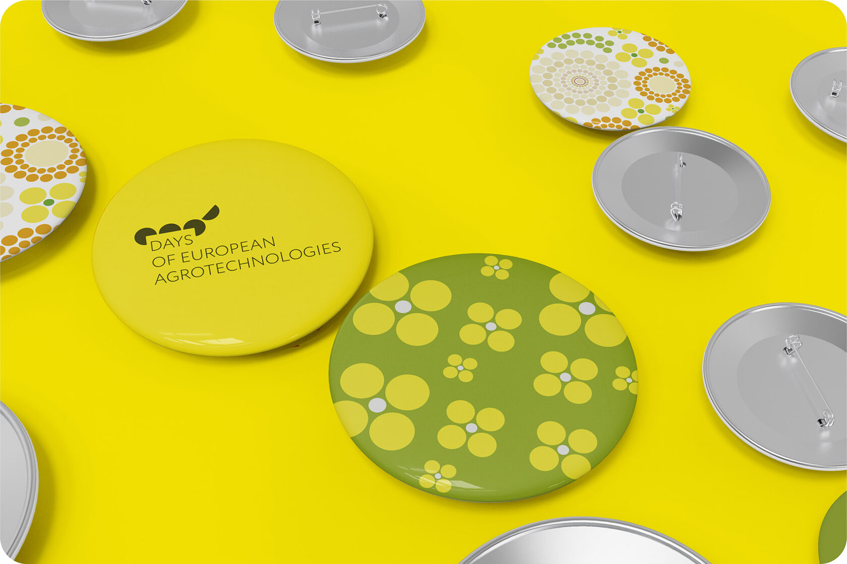
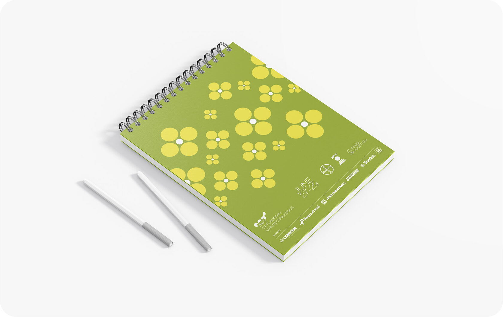


The CropScience division of Bayer and KWS are developing the agro-industrial complex in different countries. Working in the European and Asian markets, they help to increase crop yields, which contributes to the fight against global hunger. For 5 years, the companies had not been able to come to a consensus on the corporate identity of their common event “The Days of European Agrotechnologies”. Only for the first anniversary of the festival, a unified visual design system was created. It includes a logo, a corporate pattern, design templates and promotional products. The work is highly appreciated by marketing departments from both companies.
Brand Identity
Print
Visualization
Prepress
Visualization
Prepress